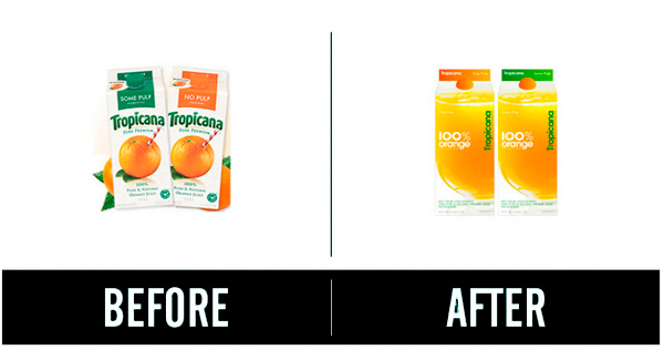
In an advertising campaign that promoted the new packaging for the fruit juice brand, Tropicana invested $35 million. The same agency, Arnell, created both the packaging design and the advertising campaign.
Launch
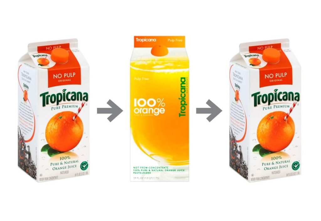
Tropicana launched the new packaging for Tropicana Pure Premium, its best-selling product in North America, on January 8, 2009, with sales revenues of more than $700 million per year. Consumers began criticizing the new design a few days later, particularly on social networks. Sales fell by 20% within two months.
This drop in sales resulted in a loss of $30 million. The credibility of the purity of Tropicana juice dropped drastically.

Reaction
People failed to recognize one of their most loved juice brands in aisles.
The reaction couldn’t have been worse than when the new packaging hit shops in January. The design was hated so much that it was difficult to believe that the public could care so much about what was printed on a carton of orange juice.
The advertising agency, Arnell, had decided to take the orange and transfer it to the bottle’s lid. The concept was creative and engaging because people could squeeze the orange cap to get fresh orange juice. The cap really had the shape and texture of an orange. This message went along with the new advertising campaign launched at the same time. “Squeeze, it’s a natural” statement was included in both the packaging and the ad.
Conclusion
What was initially an attempt to modernize and rebrand an essential food item, was turned into a debacle where loyal consumers had trust issues about the product inside the carton. The product identification attributes and connection with the brand that consumers had used for years was simply taken away.
“Pure Premium” was changed to “100% Orange”. The trusty orange with straw had become a glass of juice. Something just did not sit right and Tropicana needed to focus on the power of its packaging.
This failure in rebranding not only resulted in a huge loss of revenue but also the standing of the brand in the market.
Case Study: BufferBox – Winding Down An Acquisition By Google

