


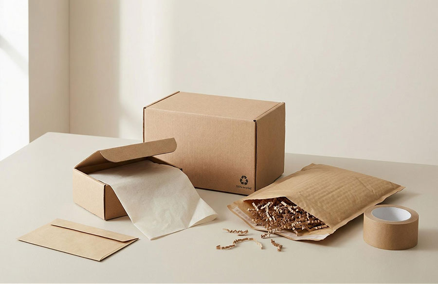
Premium packaging is not really about gold foil, rigid boxes or layers of tissue. It is about intention. When every colour, material and message feels considered, even a simple mailer can create a polished unboxing experience. For growing brands, the trick is to spend where customers notice and simplify where they do not.
Start With A Clear Visual System
A premium look begins with consistency. Choose a restrained colour palette, one or two typefaces and a clear hierarchy for your logo, product name and essential information. Repeating these choices across boxes, labels, inserts and online channels makes a brand feel established, even when the packaging components themselves are inexpensive.
Simplicity also protects your print budget. Designs with fewer colours and standard finishes can look confident and intentional without costly specialist processes. Before ordering, print a mock-up at actual size. This low-cost check helps catch type that is too small, weak contrast or a logo that loses impact on the final format.
Make One Detail Do The Heavy Lifting
Rather than upgrading every element, choose a single feature to create the sense of care. A tactile label, neatly folded thank-you card, bold seal or well-placed message inside the lid can become the memorable moment.
For plain boxes, jars, bottles and pouches, affordable custom label printing for businesses can add colour, texture and branded detail without committing to fully bespoke packaging. One versatile label design may work across several product sizes too, helping smaller ranges stay cohesive while keeping order quantities manageable.
Choose Standard Sizes And Smarter Materials
Bespoke box dimensions may sound luxurious, but standard sizes are usually easier to source and more economical. Measure the product carefully, then select the smallest practical format that protects it. Less empty space can mean less filler, lower material use and more efficient storage.
That principle supports sustainability as well as cost control. WRAP advises brands and retailers to use as little packaging as possible while still protecting the product, making right-sizing a sensible place to begin. If your packaging uses paper or board, FSC UK explains how certified packaging can support responsible sourcing, giving you a credible consideration when comparing suppliers.
Let Copy Add Character
Words are among the least expensive ways to make packaging feel distinctive. Replace generic lines with a short message that sounds like your brand. It might be warm, witty or reassuring, but it should earn its space. Care instructions, a product story or a simple prompt to reuse the pack can all add value without another physical component.
Keep the message concise and position it where it creates a small surprise. The underside of a lid, the back of a label or an insert already needed for fulfilment can carry personality without increasing the pack count.
Test Small, Then Scale
Order samples before committing to volume, and test them under real conditions. Check colours in natural light, apply labels by hand and send trial parcels through the post. Ask a few customers what felt premium and what went unnoticed. Their answers will show where extra spend matters.
Premium packaging is ultimately the result of good editing. Keep the structure simple, make one detail memorable and use consistency to build recognition. The smartest pack is not the most expensive one. It is the one that looks deliberate, protects the product and makes the customer feel they chose well.
To read more content like this, explore The Brand Hopper
Subscribe to our newsletter
Go to the full page to view and submit the form.