


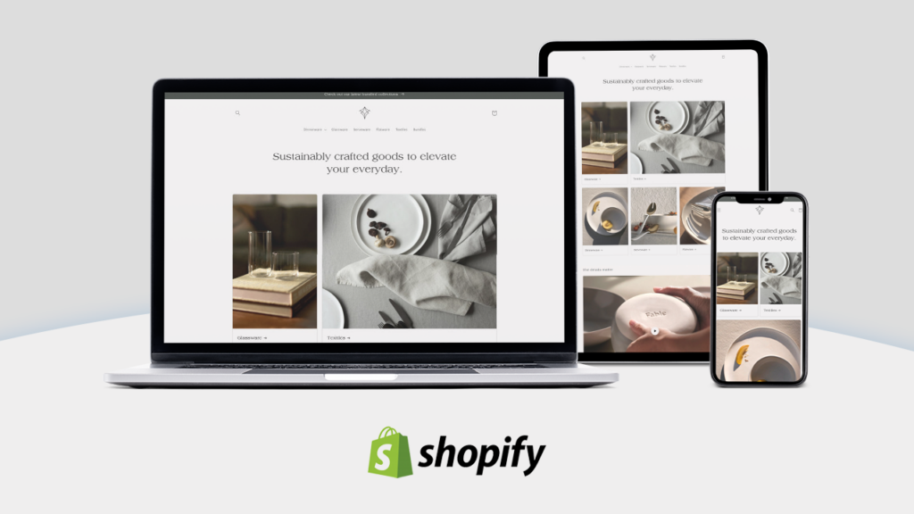
Picture a shopper landing on your store from a TikTok ad. Maybe three seconds before their thumb starts scrolling again, if that. Homepage looks like it was built in 2019? Clunky banners, cluttered nav, text nobody can read on a phone? That shopper’s gone, and honestly they were never coming back. That’s just the reality every merchant deals with now. It’s why Shopify design turned into a real competitive lever instead of a nice-to-have, somewhere in the last couple years, though nobody quite agrees on when exactly that shift happened.
The trends shaping stores in 2026 aren’t only about looking good, even though a lot of them do end up looking good as a side effect. They’re about function, speed, and trust mostly, all wrapped into something that feels effortless to use. Some of this stuff you can knock out yourself over a weekend. Swap a hero banner, tighten up your font sizes, done. Other things, a full theme rebuild, a move to headless architecture, those tend to fall under a broader scope of Shopify website design services, mostly because they need custom development work and most store owners just aren’t set up to handle that solo, nor should they try to be, honestly. Either way, knowing what’s actually changing helps you figure out where to spend your time and budget this year instead of chasing whatever showed up in your feed this morning.
Ten trends. Here’s what’s worth paying attention to and, maybe more useful, why some of them matter way more than others depending on what you actually sell.
1. AI-Assisted Personalization Is No Longer Optional
Shopify merchants have had access to AI product recommendations for a while now, that part isn’t new. What changed in 2026 is it stopped being a fancy add-on and became table stakes, the kind of thing customers expect without ever really noticing it’s even there. Apps like Shopify Magic and third-party tools such as Nosto adjust homepage layouts, product order, sometimes even copy, based on a shopper’s browsing history in real time.
Allbirds shows different homepage modules depending on whether you previously browsed men’s or women’s shoes. Small thing. But it adds up, because shoppers feel like the store gets them somehow (even if it’s just an algorithm doing basic pattern matching), and that feeling turns into fewer bounces and more stuff sitting in the cart at checkout.
Pro tip: Start small here. Even a basic “recently viewed” module or a recommendation carousel powered by Shopify’s built-in engine can lift conversion without you needing a full redesign.
2. Bento Grid Layouts Take Over Homepages
You’ll recognize this look if you’ve spent any time on Dribbble or Pinterest lately. Asymmetrical boxes of different sizes, arranged kind of like a compartmentalized lunch box, each one showing off a different product or promo or story element. Designers call it bento grid. Borrowed straight from app dashboard design, and it’s showing up on ecommerce homepages fast, faster than most people predicted even a year ago.
Fenty Beauty and Gymshark both leaned into it, mainly because it lets them show off a bunch of products, campaigns, and brand stories on one screen without it turning into a wall of banners nobody scrolls past. Works well on mobile too, since the grid just restacks into a single column without losing much visual interest along the way.
The tricky part is restraint, and a lot of stores mess this up. Cram too many competing elements into a bento layout and it turns into noise fast. Three or four hero moments, tops, and let them breathe a little.
3. Headless and Composable Storefronts Go Mainstream
Headless Shopify setups (front end decoupled from Shopify’s back end, usually using Hydrogen, Next.js, or something similar) used to be reserved for huge enterprise brands with big dev teams sitting behind them. Not anymore, or at least not exclusively anymore. More agencies package headless builds into affordable offerings now, and Shopify’s own investment in Hydrogen and Oxygen hosting shrunk the technical lift a lot over the past couple years.
So why does this actually matter for design, beyond the obvious flexibility argument everyone makes? A headless front end frees designers up from a lot of theme-based constraints. More control over animations, page transitions, custom components, that kind of thing. Tradeoff is more dev time and, often, a bigger price tag. Worth asking yourself honestly whether your catalog size and growth plans justify going headless at all, or whether a well-built Online Store 2.0 theme already covers what you need without the added headache.
When Headless Makes Sense (and When It Doesn’t)
A few quick signals worth weighing before you commit to anything:
- You’re running complex, highly custom product configurators or 3D visualizations.
- Your traffic and revenue can absorb a longer build timeline and higher maintenance costs.
- Your marketing team wants full control over landing page experimentation without waiting on theme updates.
None of that sound like your store yet? Just stick with a strong Shopify 2.0 theme then. No prize for going headless before you actually need it, and plenty of stores never will need it, full stop.
4. Micro-Interactions and Motion Design With a Purpose
Subtle animation (button that gently bounces on hover, cart icon that wiggles when something’s added, progress bar filling up as a customer scrolls a size guide) has become one of the easiest ways to make a store feel alive instead of static. Key word being subtle. Nobody wants a homepage with stuff flying in from every direction like some PowerPoint deck from 2005, and yet, somehow, you still see it out there.
Glossier nails this one. Their add-to-cart confirmation slides in soft instead of popping up jarringly, which honestly does a lot to reinforce that whole soft, approachable brand feel without much extra effort on their end. Shopify’s theme editor supports scroll-triggered animations natively in a lot of 2.0 themes now too, so custom code isn’t always needed to pull this kind of polish off, good news if you’re a smaller team without a developer just sitting around.
5. Bold, Oversized Typography as a Design Anchor
Typography quietly became one of the loudest trends going in ecommerce design right now, and I mean that almost literally, it’s loud. Instead of small, understated headlines, stores are running huge editorial-style type that eats up a third of the screen sometimes. Fashion magazine cover, not corporate brochure, and you notice the difference the second the page loads.
Rhode and Chamberlain Coffee both lean on this to make a strong first impression before a single product photo even loads in. Makes sense if you think about it: type loads faster than heavy images, and it gives a page personality without depending entirely on photography budget. If your brand doesn’t have deep pockets for photoshoots (and most don’t, especially early on), leaning on typography and color to carry visual weight can go further than people expect.
6. Sustainability and Transparency Baked Into the Page
Shoppers, younger ones especially, want to know where a product actually came from and what it cost the planet to make it. Not a footer badge anymore, not really. Brands build whole product page sections now around sourcing, materials, carbon impact, sometimes more detail than the average customer even asked for, but it seems to work anyway.
Patagonia’s led on this for years at this point, though smaller DTC brands caught up fast, using apps like EcoCart or custom “impact” modules built right onto the product page. Design-wise this usually means a dedicated content block, icons, a few short stats, sometimes a little supply chain map. None of it flashy. But it builds trust, and trust turns a browser into a buyer more reliably than another 10% off code ever will, in my experience anyway.
7. Voice Search and Conversational Commerce
Voice assistants never really took over shopping the way people predicted a few years back, that prediction basically didn’t pan out. Conversational interfaces found their footing a different way instead: on-site AI chat that lets shoppers describe what they want in plain language instead of clicking through filter after filter after filter. Type “show me a waterproof jacket under $150 for hiking in the rain” into a chat box, get three relevant results back almost instantly.
Shopify’s app ecosystem includes a handful of AI shopping assistant tools now, Rep AI and Tidio among them, plugging directly into product catalogs. Designing around this means making room for a chat interface that doesn’t feel bolted on as an afterthought, usually a persistent little icon in the corner that expands into a clean branded window instead of some generic gray box that looks dropped in from a completely different site.
8. Dark Mode and High-Contrast Themes for Niche Categories
Dark mode isn’t for every brand, obviously. A bakery probably shouldn’t go full black background, for reasons that don’t need much explaining honestly. But for categories like electronics, gaming gear, streetwear, and beauty, it turned into a legitimate design choice rather than a novelty somewhere along the way. Done well it makes product photography pop and gives a store this premium, almost cinematic feel that plain white backgrounds just don’t manage.
Razer’s a solid example here, so is Milk Makeup (Glossier’s sister brand), both using dark or high-contrast palettes to stand apart from the endless sea of white-background ecommerce sites everyone’s scrolled past a thousand times. Supplement and wellness brands are heading in a similar direction too, and the best Shopify theme for supplement stores right now tends to lean bolder instead of the clinical white-and-green look that dominated that category for way too long, honestly. One caveat, and it’s a real one: test this thoroughly before you commit. Dark backgrounds can wreck readability for body text if contrast ratios aren’t handled with real care, so accessibility testing matters more here than on most other trends on this list.
9. Mobile-First Isn’t a Trend Anymore, It’s the Baseline
This one’s been building for years, but 2026 is the year mobile-first stopped being a talking point at conferences and just became, you know, how design works. Full stop. With mobile commerce now making up the majority of Shopify traffic across most verticals (not all, but most), designers build for the smallest screen first and scale up from there, rather than the old habit of designing desktop first and shrinking it down after the fact like an afterthought.
In practice that’s thumb-friendly tap targets, sticky add-to-cart bars, simplified nav drawers, product images optimized to load fast even on a spotty connection while someone’s standing in line somewhere. Skims does this well; their mobile experience feels custom-built rather than a shrunk-down desktop layout, right down to a bottom nav bar that mirrors app-like patterns people already know from Instagram and TikTok without having to learn anything new at all.
Speed Still Wins
No amount of clever design fixes a slow page, and nothing on this whole list makes up for that either, not one thing. Shopify’s Core Web Vitals reporting inside the admin dashboard is worth checking monthly, genuinely. A few extra seconds of mobile load time can cost more conversions than a full redesign will ever recover, which is a hard thing to accept after sinking months into a new theme.
10. Modular, No-Code Customization for Faster Iteration
Section-based Shopify 2.0 themes made it possible for marketing teams to rearrange homepage content, launch seasonal campaigns, test new layouts, all without touching a line of code. In 2026 more brands treat their homepage like a living document that gets tweaked weekly instead of redesigned once a year and left alone to gather dust.
This trend’s less about a specific visual style and more about workflow honestly: modular sections, reusable blocks, metafields that let non-technical team members swap content out with confidence instead of waiting on someone else’s calendar to free up. Sneaker and streetwear labels running frequent drops rely on this kind of flexibility a lot, mostly just to keep pages fresh without waiting on a developer every single time a new release goes live.
Bringing It All Together
None of these trends exist in isolation, and that’s worth sitting with for a second before you go pick one to chase. A store that adds AI personalization but ignores mobile speed is going to struggle no matter how smart those recommendations are. A gorgeous bento grid homepage means nothing if checkout underneath it is clunky and slow. Good design in 2026 serves the shopper first, plain and simple. Faster pages, clearer information, interfaces that feel built for the actual person looking at them instead of some generic template stretched to fit whatever category you happen to sell in.
Auditing your own store? Start with fundamentals. Mobile speed, clear typography, a homepage that doesn’t overwhelm someone in the first five seconds they’re on it. Layer in the flashier stuff, AI chat, motion design, dark mode, once those basics are actually solid, not before. And redesigns don’t have to happen all at once either, that’s a myth worth killing. Plenty of the most successful stores got there through small changes stacked over months, not one big overhaul that eats a whole quarter of the year.
Summing It Up
Shopify design in 2026 is less about chasing whatever’s trending this month and more about building stores that feel fast, personal, and trustworthy, in whatever order actually makes sense for your catalog and your customers. Whether that means messing with a bento grid, testing out an AI chat assistant, or just making sure your mobile checkout doesn’t make people want to chuck their phone across the room, the brands winning right now treat design as an ongoing conversation, not some project that gets finished once and forgotten about.
To read more content like this, explore The Brand Hopper
Subscribe to our newsletter
Go to the full page to view and submit the form.