Did you know that 77% of B2B marketing leaders say branding is critical for growth? That’s right, folks! In today’s cutthroat business world, your brand isn’t just a pretty logo or a catchy slogan – it’s the very heartbeat of your company. But here’s the kicker: sometimes, that heartbeat needs a little defibrillation. Enter the wild world of rebranding!
Now, I’ve been in the marketing game for longer than I care to admit (let’s just say I remember when Facebook was only for college kids), and I’ve seen my fair share of rebranding attempts. Some soared like eagles, while others… well, let’s just say they fell flatter than a pancake at a low-carb convention.
But here’s the million-dollar question: What separates the rebranding champs from the chumps? The answer, my friends, lies in the mysterious realm of psychology. Yep, that’s right – the same stuff that makes you impulse-buy those snazzy shoes you definitely don’t need is also the key to nailing your rebrand.
In this article, we’re going to dive deep into the psychology of rebranding. We’ll unpack the emotional rollercoaster your customers go through during a rebrand, explore the sneaky cognitive biases at play, and even dabble in a bit of color theory (spoiler alert: it’s not just about picking your favorite crayon).
So, buckle up, buttercup! Whether you’re a seasoned marketing pro or a newbie entrepreneur, by the end of this brain-bending journey, you’ll have the psychological tools to make your next rebrand stick like gum on a hot sidewalk. Let’s get this show on the road!
The Emotional Impact of Rebranding on Consumers
Let me tell you a story about my friend Sarah. She’s been buying the same brand of coffee for years, and I mean years. This coffee was her morning ritual, her comfort in a cup. Then one day, bam! The company rebranded. New logo, new packaging, the works. Sarah freaked out. She called me in a panic, thinking they’d changed the coffee too!
This, my friends, is the emotional rollercoaster of rebranding. It’s like when your best friend gets a dramatic haircut – you know it’s the same person, but it takes some getting used to.
Now, let’s break this down a bit:
First off, there’s this thing called brand attachment. It’s like that ratty old t-shirt you can’t throw away because it’s “comfortable.” Consumers get attached to brands in the same way. When you mess with that, you’re messing with emotions.
Then there’s nostalgia. Oh boy, nostalgia is a powerful drug. I once saw a grown man cry over the return of his favorite childhood cereal. Brands often tap into our past, and changing that can feel like erasing a piece of personal history.
But, rebranding isn’t always about loss. Sometimes, it’s about reinvention. Take Resume Now, for example. Their resume templates and examples from Resume Now make it easier for job seekers to refresh their professional identity. Just like brands update their image to stay relevant, individuals must also evolve their resumes to reflect their latest achievements and skills. It’s a great example of how change, when done right, can actually be empowering.
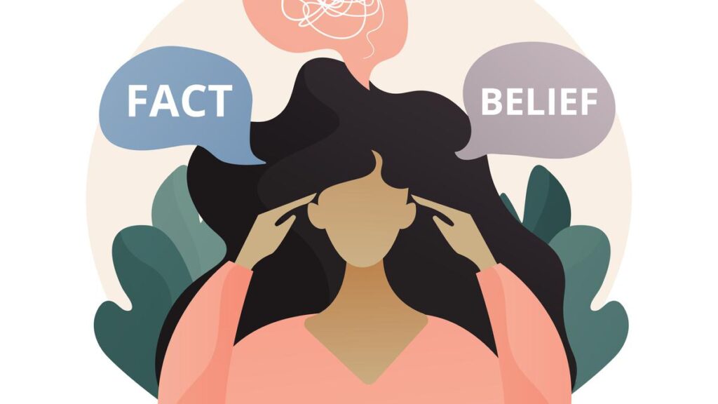
Here’s where it gets really interesting: cognitive dissonance. It’s a fancy term for that uncomfortable feeling when things don’t match up in your brain. During a rebrand, customers might struggle to reconcile the new brand image with their existing perceptions. It’s like seeing your teacher outside of school – it just feels wrong!
But here’s the kicker – rebranding can also build new emotional connections. It’s an opportunity to say, “Hey, we’ve grown, and we want to grow with you.” When done right, it can strengthen the bond between brand and consumer.
The trick is to acknowledge these emotional responses. Don’t just slap on a new logo and call it a day. Take your customers on the journey with you. Explain the why behind the change. Show them that while the packaging might be different, the heart of the brand – the part they fell in love with – is still there.
Remember Sarah? After I talked her off the ledge and she actually tried the “new” coffee, she realized it was the same great taste she loved. Now she feels like she’s in on a secret, part of the brand’s evolution. And isn’t that what we all want? To feel like we’re part of something bigger?
In the end, rebranding is as much about managing emotions as it is about updating visuals. It’s a delicate dance, but when you nail it, oh boy, it’s like watching a beautiful tango. Smooth, captivating, and leaving everyone wanting more.
Cognitive Biases That Influence Rebranding Success
Alright, folks, buckle up! We’re about to take a wild ride into the twisted theme park that is the human brain. Trust me, it’s gonna be more fun than a barrel of monkeys… and probably just as chaotic.
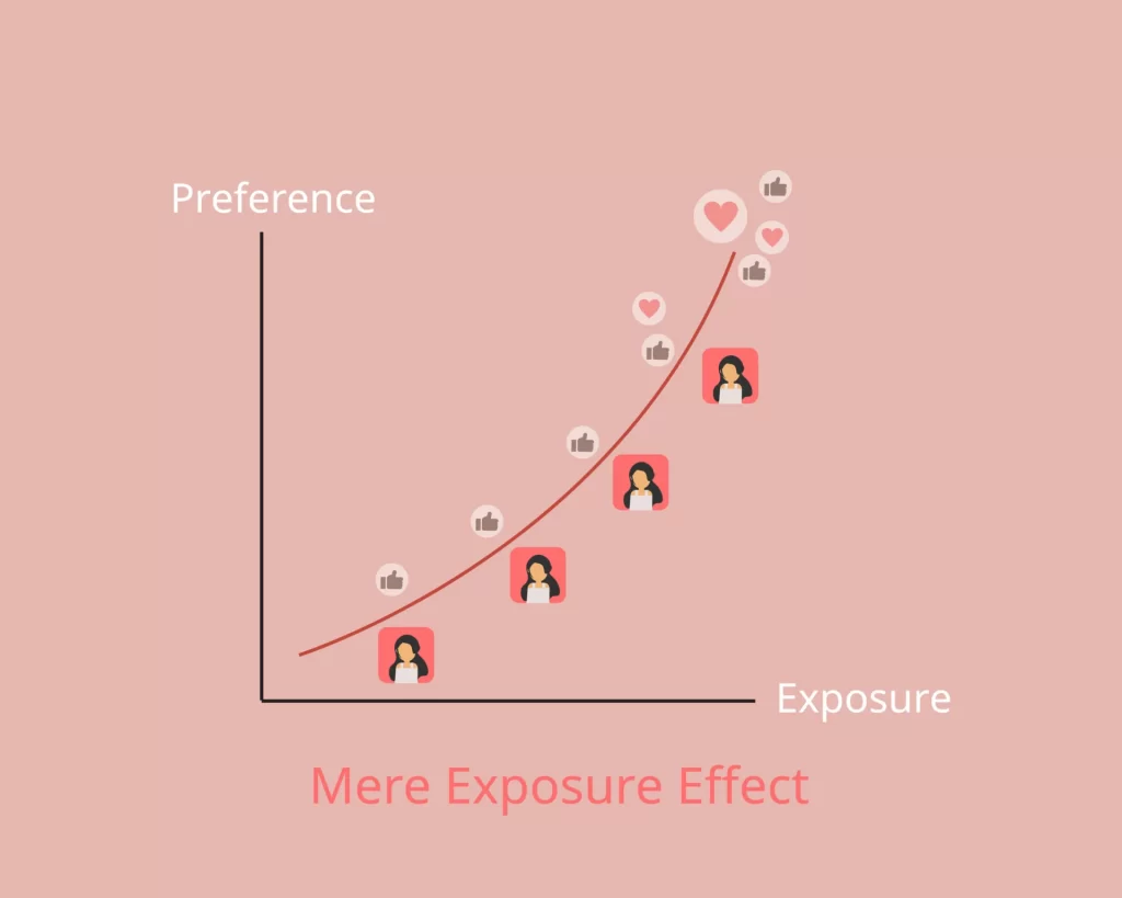
First stop: the Mere Exposure Effect. No, it’s not a new indie band. It’s this weird quirk where we tend to like things simply because we’re familiar with them. It’s why that annoying jingle from the local car dealership is stuck in your head. In rebranding, this bias can be both a blessing and a curse. On one hand, people might resist change because they’re comfy with the old brand. On the other, if you gradually introduce new elements, people might start liking them just because they keep seeing them. Sneaky, huh?
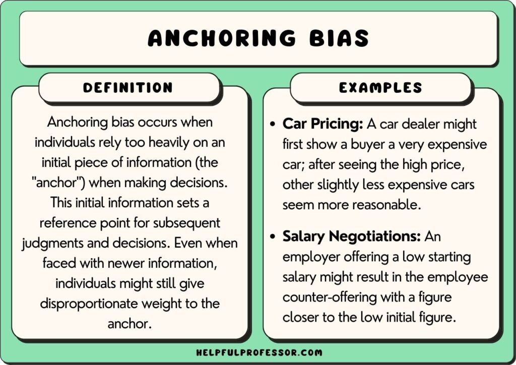
Next up: Anchoring Bias. This is the brain’s cute little habit of relying too heavily on the first piece of information it gets. In rebranding, this means that people might judge your new brand based on their first impression of it. So if your new logo looks like it was designed by a toddler with a crayon, well… good luck changing that perception.
Now, let’s talk about the Halo Effect. No, we’re not discussing video games. This is when one positive trait creates a rosy glow around everything else. For example, if people love your new slogan, they might suddenly think your product is better too, even if nothing’s changed. It’s like beer goggles, but for brands!
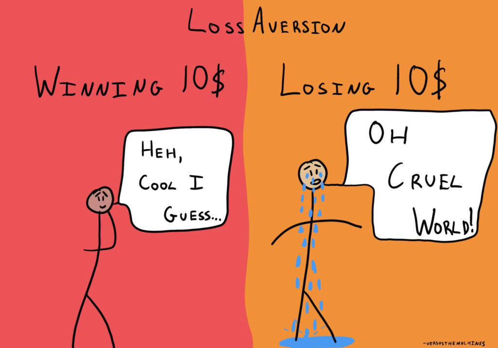
Last but not least: Loss Aversion. Humans hate losing stuff. We hate it about twice as much as we like gaining stuff. Weird, right? In rebranding, this means people might cling to the old brand because they feel like they’re losing something, even if the new brand is objectively better. It’s like when I tried to throw out my husband’s ratty old college t-shirt. You’d think I was trying to toss out the dog!
So, how do we use this psychological cocktail to our advantage? Well, it’s all about balance. Introduce new elements gradually to leverage mere exposure. Make sure that first impression is stellar to anchor positive perceptions. Create a halo effect by highlighting the best parts of your rebrand. And always, always, emphasize what customers are gaining, not losing.
Remember, folks, the human brain is like a quirky old computer running on a bunch of outdated software. It doesn’t always make sense, but if you know how to work it, you can make magic happen. Now, if you’ll excuse me, I need to go convince my husband that a new t-shirt won’t be the end of the world.
Color Psychology in Rebranding
Alright, color me excited because we’re about to paint the town… well, whatever color psychology tells us to!
Let me tell you, choosing colors for a rebrand is not just about picking your favorite shade from the Crayola box. Oh no, it’s more like being a detective, a cultural anthropologist, and a mind reader all rolled into one.
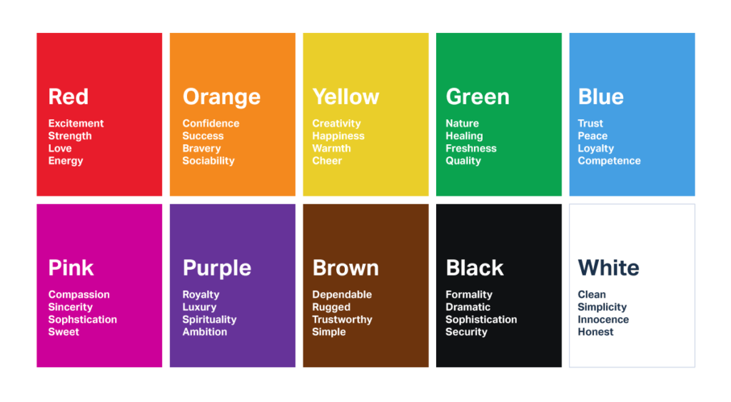
First things first, colors pack a punch when it comes to brand perception and recall. It’s like how you can spot those golden arches from a mile away when you’re hangry on a road trip. Colors can make your brand pop like a firework or blend in like a chameleon at a disco.
But here’s where it gets tricky – colors don’t mean the same thing everywhere. Oh no, that would be too easy! Red might scream “Stop!” in the US, but in China, it’s shouting “Prosperity!” at the top of its lungs. I learned this the hard way when I wore white to a wedding in India. Spoiler alert: white is for funerals there. Talk about a fashion faux pas!
Let me give you a real-world example. Remember when Apple went from their rainbow apple to the sleek, monochrome look? That wasn’t just because Steve Jobs had a minimalist phase. The new look screamed sophistication and simplicity, perfectly aligning with their brand personality. It’s like they grew up from a quirky teenager to a suave adult.
Now, choosing the right colors for your rebrand is like picking the perfect outfit for a blind date. You want to make a great first impression, show off your personality, and hopefully not spill spaghetti sauce all over yourself.
Here’s a pro tip: don’t just pick colors willy-nilly. Think about what your brand personality is. Are you the fun, playful type? Maybe bright, vibrant colors are your jam. More of a serious, trustworthy brand? Cool blues and greens might be your best friends.
And please, for the love of all that is holy, test your colors! What looks great on your computer screen might look like baby food on a billboard. I once saw a brand use a yellow so bright on their packaging, I thought the sun was attacking me in the grocery store.
Remember, colors are powerful tools in your rebranding toolbox. Use them wisely, and you’ll paint a masterpiece that’ll make Van Gogh jealous. Use them poorly, and well… let’s just say you might end up with something that looks like my kid’s finger painting after taco night.
Now, if you’ll excuse me, I need to go rethink my entire wardrobe based on color psychology. Who knew my lucky purple socks were sending such mixed messages?
The Power of Storytelling in Rebranding Campaigns
Gather ’round, folks, because we’re about to dive into the wonderful world of “Once upon a time” – rebrand edition!
Now, I’ve got a confession to make. I’m a sucker for a good story. Seriously, I once spent an entire weekend binge-watching a show about the riveting life of a professional organizer. (Don’t judge me, Marie Kondo is a national treasure!) And guess what? Your customers are no different. They’re hungry for stories that’ll make them laugh, cry, or at the very least, stop scrolling for a hot second.
You see, storytelling in rebranding is like adding secret sauce to your burger. Sure, the burger’s good on its own, but that sauce? It’s what makes people come back for more, even if they can’t quite put their finger on why.
Let’s talk about brand archetypes for a sec. These are like the characters in the grand story of your brand. Are you the Hero, swooping in to save the day? The Rebel, shaking things up? Or maybe you’re the Caregiver, all warm and fuzzy. Choosing your archetype is like picking your avatar in a video game – it sets the tone for your whole adventure.
I once worked with a tech company that was rebranding. They’d always been the Sage, all about knowledge and expertise. But they wanted to shake things up, become more approachable. So we shifted their story to the Explorer archetype. Suddenly, they weren’t just sharing knowledge – they were inviting customers on a journey of discovery. Their rebrand story was all about venturing into new territories together. Let me tell you, their customers ate it up like it was the last slice of pizza at a party!
Now, here’s the million-dollar question: why are you rebranding? This isn’t just for your internal meetings, folks. Your customers want to know too! Are you evolving with the times? Expanding your horizons? Whatever it is, wrap it up in a story that’ll tug at those heartstrings.
But here’s the kicker – you’ve got to measure how well your story’s landing. Are people sharing it? Talking about it? Or are they using your new logo as a cautionary tale? (Trust me, you don’t want to end up like that one juice company whose logo accidentally looked like, well… let’s just say it wasn’t family-friendly.)
Remember, a good rebrand story is like a catchy pop song. It should be simple enough that people can repeat it, but unique enough that they want to. Get it right, and you’ll have customers singing your praises louder than me belting out “Don’t Stop Believin'” in the shower.
So, what’s your brand’s story? Is it a thrilling page-turner or more of a snooze-fest? Whatever it is, make sure it’s authentic. Because in the world of rebranding, the only thing worse than no story is a story that’s as fake as my Aunt Mildred’s “all-natural” hair color.
Now, if you’ll excuse me, I’ve got some brand fanfiction to write. What? Don’t act like you’ve never imagined your favorite brands hanging out together!
Leveraging Social Proof in Rebranding Efforts
Alright, gather ’round, because we’re about to dive into the wild world of social proof. It’s like peer pressure, but for brands!

Now, I don’t know about you, but I’ve definitely bought something just because my friend Sarah wouldn’t shut up about how amazing it was. (Spoiler alert: that miracle face cream did not, in fact, make me look 10 years younger overnight. Thanks a lot, Sarah.) But that, my friends, is the power of social proof in action.
When it comes to rebranding, social proof is like your popular friend vouching for you at a new school. It can make or break how quickly people warm up to your new look.
Let’s talk influencers for a hot second. These are the cool kids of the internet, and getting them on board with your rebrand is like having the homecoming queen wear your band’s t-shirt. Suddenly, everyone wants a piece of the action. I once saw a small tech company’s rebrand go viral overnight because a big-name tech reviewer gave it a thumbs up. It was like watching a nerd become prom king!
But here’s the thing – influencers aren’t the only game in town. Customer testimonials are like gold dust in the rebranding world. It’s one thing for you to say, “Hey, we’ve changed and we’re awesome now!” It’s a whole other ballgame when Janet from accounting says, “This rebrand has changed my life! I now file expense reports with joy!” (Okay, maybe that’s a bit of a stretch, but you get the idea.)
Now, let’s talk about creating a sense of community around your new brand. This is where the magic really happens. It’s like creating a secret club, but instead of a treehouse, you’ve got a shiny new brand identity. When people feel like they’re part of something, they’ll defend it like a mama bear protecting her cubs. I once saw a heated argument break out in a coffee shop over which brand of smartphone was better. It was like watching a debate team on espresso!
But beware, my friends, because social proof is a double-edged sword. Negative buzz can spread faster than gossip at a high school reunion. If people start trash-talking your rebrand, it can snowball quicker than you can say “PR nightmare.”
So, how do you handle the haters? Transparency is key. If something’s not working, own up to it. People respect honesty. It’s like that time I admitted my homemade sushi looked more like abstract art than food. Sure, it was embarrassing, but hey, at least I got points for honesty!
Remember, leveraging social proof in your rebrand is all about creating a bandwagon so cool, everyone wants to jump on. Make people feel like they’re part of an exclusive club, like they’re in on a secret. Before you know it, they’ll be singing your praises louder than a tone-deaf karaoke enthusiast.
Now, if you’ll excuse me, I need to go leave a glowing review for my favorite coffee shop. They just rebranded, and I’m pretty sure my opinion is going to single-handedly make or break their success. (Hey, a girl can dream, right?)
The Psychology of Logo Design in Rebranding
Alright, folks, it’s time to talk about the prima donna of the branding world – the logo. It’s like the lead singer of a band; it might not be the whole show, but it’s definitely what people remember.
Now, let me tell you about the time I tried to design a logo for my friend’s dog-walking business. I thought, “How hard can it be? I’ll just draw a cute dog!” Three days, 50 sketches, and one minor breakdown later, I realized that logo design is more complicated than trying to assemble IKEA furniture after three glasses of wine.
First up, we’ve got the Gestalt principles. No, it’s not a type of German beer. These are the psychological principles that explain how our brains make sense of visual information. It’s like our brain’s way of playing connect-the-dots with what we see.
For instance, take the FedEx logo. Did you know there’s an arrow hidden between the ‘E’ and the ‘x’? Once you see it, you can’t unsee it. That’s the principle of closure at work – our brain fills in the gaps to create a complete image. Sneaky, right?
Now, let’s talk about simplicity versus complexity in logo redesigns. It’s like the difference between a minimalist Japanese garden and my Aunt Mildred’s overcrowded knick-knack shelf. Most brands these days are going for the Japanese garden look. Think Apple’s journey from their detailed, rainbow apple to the sleek, monochrome one we know today. It’s like they went on a digital diet and came out looking all svelte and modern.
But here’s the kicker – simple doesn’t always mean better. It’s all about what works for your brand. I once saw a craft brewery try to simplify their intricate, vintage-style logo into a modern, minimalist design. Let’s just say it had all the charm of a tax form. Sometimes, complexity tells a story that simplicity just can’t match.
Now, let’s dive into the murky waters of symbolism and metaphor in logos. This is where things get really fun. A good logo is like an inside joke between a brand and its customers. Take Amazon’s logo, for example. That little arrow doesn’t just make a smile; it also goes from A to Z. It’s like they’re winking at us, saying, “Yeah, we’ve got everything, and we know you know it.”
But be careful with your symbolism. One wrong move and you could end up like that unfortunate company whose new logo accidentally resembled… well, let’s just say it was NSFW. Oops!
Remember, folks, a logo redesign is like plastic surgery for your brand. When it’s good, it can take years off and give you a whole new lease on life. When it’s bad… well, let’s just say there’s a reason why some celebrities end up on those “botched surgery” shows.
The key is to know your brand inside and out. Your logo should be like a mini billboard for your brand’s personality. If your brand were a person, would they be the life of the party or the quiet intellectual in the corner? Your logo should reflect that.
And please, for the love of all that is holy, test your logo before you launch it! What looks great on your computer screen might look like a Rorschach test gone wrong on a billboard.
Now, if you’ll excuse me, I need to go stare at some logos and ponder the meaning of life… or at least the meaning of good design. Who knew looking at little pictures could be so existentially challenging?
Psychological Strategies for Managing Brand Loyalty During Rebrands
Alright, buckle up, because we’re about to navigate the treacherous waters of brand loyalty during a rebrand. It’s like trying to tell your cat you’ve switched their favorite food – there might be hissing involved.
First things first, let’s talk about trust. It’s like the secret sauce in a long-lasting relationship, except instead of two people, it’s between a brand and thousands (or millions) of hangry customers. When you’re rebranding, maintaining trust is more important than making sure you don’t pocket dial your ex at 2 AM.
Here’s a little story for you. I once worked with a company that decided to rebrand without telling anyone. They just showed up one day with a new logo, new colors, the works. It was like your spouse coming home with a dramatic haircut and new wardrobe without any warning. Chaos ensued. Customers were confused, employees were blindsided, and don’t even get me started on the poor social media team. The lesson? Transparent communication is key, folks.
Now, let’s chat about the speed of change. Should you rip off the band-aid or ease into it like a cold swimming pool? Well, it depends. Gradual changes can be like slowly turning up the heat on a frog in a pot (don’t try this at home, folks). People might not even notice they’re accepting the new brand until they’re fully cooked… er, I mean, on board.
On the flip side, a sudden change can be like jumping into the deep end. It’s shocking at first, but if you’ve got a strong brand, your loyal customers will learn to swim pretty quick. Just make sure you’ve got some floaties ready for those who need a little extra help.
Consistency is another biggie. It’s like making sure your socks match, but on a much larger scale. If your website is rocking the new brand but your Twitter is stuck in 2010, you’re gonna confuse people more than a cat with a cucumber. (If you haven’t seen those videos, do yourself a favor and look them up. You’re welcome.)
Here’s a pro tip: involve your customers in the rebranding process. It’s like letting your kids help cook dinner. Sure, it might get a little messy, but they’re much more likely to eat their vegetables if they had a hand in making them. I once saw a company let their customers vote on the final logo design. The engagement was off the charts, and when the new brand launched, those customers defended it like mama bears protecting their cubs.
Remember, brand loyalty isn’t just about liking a product. It’s emotional. It’s personal. People integrate brands into their identities. Changing a brand they love is like telling them to change a part of themselves. So be gentle, be understanding, and for the love of all that’s holy, don’t pull a Gap. (If you don’t know what I’m talking about, Google “Gap logo disaster 2010”. It’s a cautionary tale for the ages.)
The key to managing brand loyalty during a rebrand is to make your customers feel like they’re part of the journey, not just along for the ride. It’s the difference between being the cool parent who lets their kid “help” drive by sitting on their lap and steering, versus the parent who makes their kid sit in the back seat with no say in the road trip playlist.
In the end, remember that change is hard for everyone. Your loyal customers might kick and scream a little, but if you’ve built a strong relationship with them, they’ll come around. It’s like when I tried to get my dog to wear booties in the snow. There was initial resistance (and some hilarious high-stepping), but now he prances around in them like he’s on a canine catwalk.
So there you have it, folks. Managing brand loyalty during a rebrand is part science, part art, and part group therapy session. But get it right, and you’ll have customers more loyal than my labrador when I’m eating a steak.
Now, if you’ll excuse me, I need to go explain to my cat why I moved his favorite sunbathing spot. Wish me luck – I might need those brand loyalty strategies sooner than I thought!
Conclusion:
Phew! What a wild ride through the twisted corridors of the human mind, am I right? We’ve laughed, we’ve cried (okay, maybe that was just me when I remembered the Great Logo Disaster of ’18), and hopefully, we’ve all learned a thing or two about the psychology of rebranding.
Let’s recap, shall we? We’ve discovered that rebranding is more than just slapping on a new coat of paint. It’s about understanding the emotional rollercoaster your customers are on, navigating the minefield of cognitive biases, painting with the psychological power of color, spinning a yarn that would make Shakespeare jealous, rallying the troops with social proof, crafting a logo that speaks louder than words, and nurturing brand loyalty like it’s a delicate orchid in a hurricane.
But here’s the kicker, folks. All this psychological mumbo-jumbo? It’s not just for big corporations with more money than sense. Oh no, this is for you – yes, you! Whether you’re a solopreneur working from your garage (no judgment, we’ve all been there), or a marketing team trying to convince your CEO that no, Comic Sans is not an appropriate font choice for a law firm, these insights can help you craft a rebrand that sticks.
So, what now? Well, I challenge you to take these pearls of wisdom and apply them to your own branding efforts. Maybe you’re not planning a full rebrand right now. That’s cool. But perhaps you could tweak your color scheme to better align with your brand personality. Or maybe you could craft a story that makes your customers feel like they’re part of something bigger.
Remember, branding isn’t a “set it and forget it” kind of deal. It’s more like a garden – it needs constant tending, occasional pruning, and sometimes, a complete overhaul when the seasons change.
And hey, I want to hear from you! Have you been through a rebrand? Are you planning one? Did you once witness a rebranding disaster so epic it made the Hindenburg look like a minor inconvenience? Share your stories in the comments! Let’s learn from each other’s triumphs and facepalms.
Because at the end of the day, we’re all in this crazy world of branding together. And if we can’t laugh at our missteps, commiserate over our challenges, and celebrate our victories, then what’s the point?
So go forth, brave brand warriors! Armed with the psychology of rebranding, you’re ready to take on the world. Or at least, you’re ready to convince your boss that the company mascot doesn’t need to be a dancing pickle. Baby steps, people. Baby steps.
Also Read: Brand Extension – Meaning, Advantages and Disadvantages
To read more content like this, subscribe to our newsletter

