Last Updated on September 26, 2025 by Team TBH
I won’t surprise anyone by stating that conversion is elusive. Duh. Every online store wants more, yet few achieve it consistently. Product pages are where a visitor decides whether to buy or leave. Optimizing a product page isn’t a one-off chore. It’s a continuous experiment, a dance between design, copy, and human behavior.
Tiny tweaks can create outsized results, yet the outcome always hinges on context, the device, and how your visitor thinks. Nothing stands alone. Every element interacts, and knowing those interactions is where the magic happens. That’s exactly what we’re diving into today.
So let’s get started!
The Anatomy of a Product Page
Before you optimize, you must understand. A product page is more than an image and a price. It is a communication channel, a microcosm of your brand. Every element speaks to the visitor. Some pages fail because they overload the visitor with information. Others fail because they assume the visitor will intuitively know everything.
A typical product page includes:
- Product title
- Product images or videos
- Price and promotions
- Product description
- Key features or specifications
- Social proof: reviews, ratings, testimonials
- Trust signals: guarantees, certifications, return policies
- Call to action: Add to Cart, Buy Now
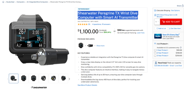
Take this page for example.
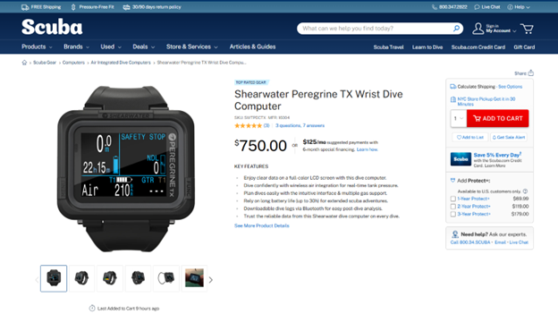
Almost all of the mentioned components are present on the product page. And yet, they can (and should) be optimized.
But optimization is not a checklist. You do not simply add a review section and expect conversion to double. The impact depends on how well it integrates with the other elements. It depends on the visitor, the device, the context. A product page that converts well on desktop may flop on mobile if images load slowly or buttons are hard to tap.
Titles That Capture Attention
Product titles are more than names. They are promises. A visitor scanning a list of results will decide in seconds whether to click. If your title is vague or overly technical, it will be ignored. If it is descriptive, clear, and enticing, you have a chance.
Good titles often include:
- The product type
- Key feature or differentiator
- Size, color, or variant if relevant
For example, a title like “Shearwater Peregrine TX Wrist Dive Computer with Smart AI Transmitter” conveys what it is, why it matters, and the key option. Compare that to “Shearwater Peregrine Model TX-923.” One tells a story, the other tells nothing.
It is worth testing small variations. Sometimes adding a single word like “Ergonomic” or “Adjustable” can increase conversion. Sometimes it decreases it. The only way to know is through testing, and by observing how visitors respond.
Images and Videos That Sell
Humans are visual creatures. A high-quality image can convey more than a thousand words. But not all images are equal.
- Use multiple angles to give a full view
- Show the product in use to provide context
- Include zoom and interactive features
- Keep file sizes optimized to prevent slow loading
Videos can be even more persuasive. A 30-second clip showing the product in real life can answer questions, demonstrate functionality, and create desire. But the video must be fast-loading and relevant. A poorly produced video will harm more than it helps.
It is also crucial to understand the psychological impact of images. A product shown in isolation may feel abstract. A product in a lifestyle setting feels tangible. For example, a lamp on a plain background is informative. A lamp on a cozy bedside table is aspirational. Both are useful, but the latter often drives higher engagement.
Descriptions That Convert
A product description is not just a list of specifications. It is a narrative. It tells the visitor why the product exists, what problem it solves, and how it improves their life. Many pages fail because descriptions are either too technical or too generic.
A good product description usually contains:
- A headline or hook that summarizes the benefit\
- Features presented in bullet points for scannability
- A narrative paragraph that explains how the product improves the customer’s life
- Optional technical details or dimensions for informed buyers
For instance, consider a fitness tracker. A weak description might read: “Tracks steps, calories, and heart rate. Water resistant. Bluetooth enabled.” A stronger version might read: “Stay on top of your health effortlessly. Track your steps, calories burned, and heart rate in real time. Swim, sweat, and jog without worry – this tracker keeps up with your life.” One version conveys data, the other conveys value. Conversion tends to follow value, not data.
Price and Promotions
Pricing is easy enough on paper: slap a number on a product and call it a day. But in reality, the number whispers a thousand subtler things. Visitors don’t just see “$49.99.” They see “$49.99 compared to the other guy,” “$49.99 compared to what I expected,” and “$49.99 for something that looks this good?” Pricing is psychology, not arithmetic.
Discounts are tricky creatures. Show them, yes, but don’t go overboard. A little flair can spark urgency—a flash of “limited-time offer” makes shoppers twitch their credit cards—but if every product is always half off, your brand starts feeling like a carnival. You want the visitor to feel clever for buying, not hoodwinked by a pop-up shouting 50 percent off.
Higher-ticket items, by the way, deserve some perspective. Displaying a monthly equivalent can turn a gut-wrenching $1,200 into a manageable $100-a-month, which is psychologically smoother.
Social Proof
People are herd animals. Show them that others have bought, liked, and survived, and they follow. Social proof is the single strongest nudge toward conversion. But it’s got to be genuine—authenticity beats perfection. Five-star-only reviews scream “fake” louder than a foghorn. A page sprinkled with both praise and complaints reads believable, human, real.
Other tricks include high-quality photos from actual buyers, verified purchase badges, and the occasional “Over 1,342 people bought this last month” headline. It’s subtle, but it works. People like to feel part of a successful crowd.
Trust Signals
Even if your product could cure hiccups instantly, a wary visitor hesitates. Trust signals are your peacekeepers: the “30-day money-back guarantee,” the little padlock next to a payment form, a shipping promise. They don’t need fireworks or glitter—just clarity and visibility. These tiny cues quietly whisper, “Go on. Buy. Nothing bad will happen.”
Common trust signals include:
- Return and refund policies
- Secure payment badges
- Certifications and guarantees
- Shipping details
Call to Action
Here’s the battlefield: the CTA. A button labeled “Add to Cart” seems trivial, but placement, color, and phrasing can make or break a sale. The CTA needs to jump out without yelling, to invite action without coercion. Action-oriented words work best.
A long page deserves repeated calls; you don’t want a visitor to scroll for eternity and forget the point. Testing is king here. “Get Yours Today” might beat “Add to Cart” in ways that make your analytics blush.
Testing and Iteration
Optimization is a lifelong laboratory. Educated guesses are fine, but testing gives certainty. Show two page versions to different visitors and measure. Track conversion rate, bounce rate, session length, add-to-cart clicks, and checkout completions.
One tweak may help one metric and hurt another. Patience is essential; small improvements accumulate into a giant leap. A 0.5 percent bump here, 1 percent there, and suddenly your business is running smoother than a well-oiled blaster.
Key metrics to track:
- Conversion rate
- Bounce rate
- Average session duration
- Add-to-cart rate
- Checkout completion
Advanced Techniques: Selling Digital Products
Once the basics are safe, you can get fancy. These include personalization, dynamic promotions, and AI-powered recommendations. Your techniques here differ depending on the type of product you sell.
Differentiate techniques for physical and digital products
Say you’re selling digital products such as courses, worksheets, or lesson plans, the rules shift slightly. I don’t need to remind you that your approach to selling a PDF lesson plan shouldn’t be the same as your method of selling a car.
For example, here’s how to sell lesson plans online with a well-optimized product page.
For starters, you need to keep in mind your visitor: a teacher. Then, you need to focus on their on-page experience and the perceived value.
Thus, your page optimization actions are:
- Show previews or samples so teachers know what they pay for
- Highlight the grade level, subject, and learning outcomes
- Offer lesson bundles to drive up the perceived value
- Feature social proof, like reviews from other teachers
- Provide instant downloads and easy access to drive sales
A good way to do it is shown below.

Think of this example of a product page for lesson plans as a mini classroom. Every image, every description, every headline should teach something about the product without confusing the visitor.
Testimonials from certified teachers or guarantees for updated content go a long way. Your call to action should feel natural and urgent, something like “Download Your Lesson Plan Today” works better than generic prompts.
Psychological Triggers
Conversions are often invisible handshakes of the mind. Social proof, authority cues, scarcity, reciprocity: they all work, but subtly. Overdo it and you look like a carnival barker, not a guide. Balance is key.
Some of the most effective triggers include:
- Social proof (remember the teacher reviews in one of the previous sections?)
- Authority elements like industry awards
- Scarcity and urgency (hurry up: only 5 products left)
- Reciprocity triggers like gifts or free shipping
The Role of Analytics
Don’t wander around without data. It’s your map. And in the case of HotJar and other similar tools, it’s a heatmap.
Use Google Analytics, heatmaps, and session recordings to check how your users move through the page. Discover their hesitation points, confusion zones, and checkout escape hatches. Fixing these friction points often gives the biggest gains.
Metrics to consider include:
- Click-through rates on CTAs
- Scroll depth
- Engagement with images or videos
- Drop-off points in the checkout process
Common Mistakes
Even pros slip. So don’t get frustrated if you do. But, generally, steer clear of the following mistakes:
- Make the page look busy with information or visuals
- Forgetting about optimization for mobile devices
- Copying competitors without testing
- Relying on assumptions rather than data
- Using misleading claims or fake reviews
Wrapping up
Product page optimization is both a science and a gentle art. Every detail counts—from titles to CTAs to load speed. Small improvements go a long way. So, test what works, and then double down on it to stay on top of your competitors.
Remember: Conversion is not an accident. It’s a product of arduous experimentation and refinement. With some tenacity and grit, you’ll get there!
To read more content like this, explore The Brand Hopper
Subscribe to our newsletter