In today’s fast-moving market, brands must evolve or risk becoming irrelevant. Stagnation is costly – as it’s more of a risk for a business to remain stagnant than to attempt to change. Consider Apple: in the early 1990s it was faltering, but a bold rebrand (dropping the old rainbow logo for a sleek monochrome design) signaled a new era and helped revive the company. Even household names like Coca-Cola and Starbucks periodically tweak their branding – Coca-Cola with subtle logo adjustments and Starbucks by simplifying its iconic logo – to stay fresh. In short, refreshing or rebranding your identity can breathe new life into a company. But when should you do a minor refresh versus a full rebrand? Brand managers should weigh their goals carefully, drawing on strategy and real-world examples.
What Is a Brand Refresh?
A brand refresh is a moderate makeover of a company’s image. It involves small-to-medium updates that keep the core identity intact but modernize how the brand looks and sounds. In practice this might mean tweaking the logo, updating fonts, revising the color palette or refining messaging – but not changing the brand’s fundamental values, name or positioning.
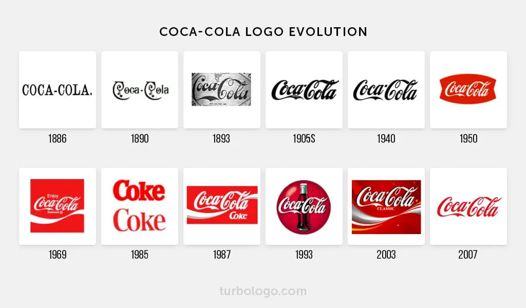
A refresh is “about staying fresh and relevant without changing your brand’s core identity”. For example, Coca-Cola has over the decades refined its script logo and packaging styling while keeping the key design elements recognizable, and Starbucks removed the word “Starbucks” from its logo to create a cleaner, more digital-friendly image. These are brand refreshes: the companies stayed true to their heritage (red-and-white script and the mermaid icon) but applied a visual lift to stay contemporary.
Brand refreshes are often done to realign with market trends. Superside advises conducting market research and a brand audit to spot outdated elements. If you find that your logo looks dated or your website feels clunky, a refresh can fix those. Typical refresh activities include:
-
Visual updates: Modernizing the logo (slight redraw, simplified form), swapping in a new font, or updating the color palette for more vibrancy or accessibility.
-
Verbal tweaks: Sharpening the tagline or writing style to appeal to new customers, or refining brand voice to sound more current.
-
Collateral revamp: Refreshing marketing materials (brochures, website, signage) so everything looks cohesive and up-to-date without abandoning familiar brand cues.
A refresh is basically a tune-up, not a full rebuild. It’s like sending an old suit to the tailor rather than buying a completely new wardrobe. The goal is to make the brand feel modern and resonate with today’s customers, while preserving the underlying brand equity.
For instance, Walmart’s 2025 refresh kept the company’s signature blue color and logo tone but modernized the font and graphics to appear more vibrant. T-Mobile similarly gave its brand a subtle color update (“New Magenta”) that played up existing equity rather than replacing it entirely. These are classic refresh strategies – familiar enough that customers recognize the brand, but fresh enough to signal evolution.
What Is a Rebrand?
A rebrand is much bigger. It’s a fundamental overhaul of a company’s identity and strategy. Whereas a refresh tweaks existing elements, a rebrand may change them entirely. This can include altering the brand’s positioning, mission, values, or even its name and core visual identity. In effect, a rebrand resets the foundation of the brand. Rebrands usually happen in response to big changes: market shifts, mergers, new leadership, or the need to leave behind a dated or negative image.
According to experts, a rebrand might involve:
-
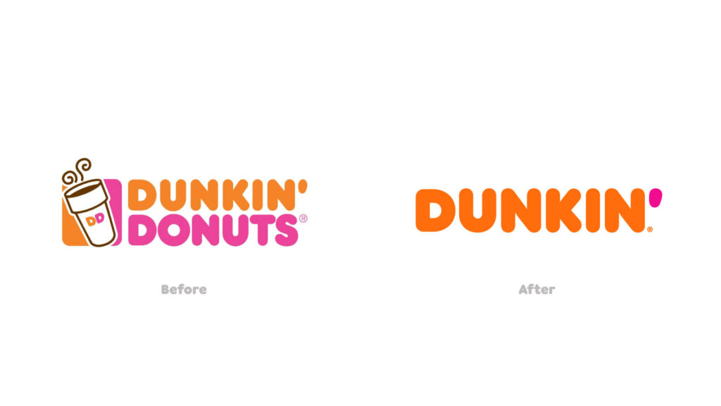
Name and logo changes: Possibly a new company name or logo design that looks very different from the old one. (Think Dunkin’ dropping “Donuts” and redesigning its logo for a coffee-centric identity.)
-
Brand positioning and values: Redefining who the brand is for and what it stands for. This could mean targeting a new audience or promising different benefits. (For example, when Weight Watchers rebranded as WW, it shifted from focusing on weight loss to a broader “wellness” positioning.)

-
Messaging overhaul: Changing the tagline, tone, and key messages to reflect the new identity. A rebrand usually comes with new marketing copy and campaigns.
-
Organizational changes: Aligning company vision, mission and culture with the new brand. A full rebrand often means getting buy-in from leadership and stakeholders to execute the change completely.
In short, refresh = evolution, rebrand = revolution. Superside sums it up: “A brand refresh is an evolution of the existing brand identity… In contrast, a full rebrand is a significant shift – a complete overhaul of the brand’s positioning, name, values and visual identity”. Focus Lab similarly notes that a rebrand “will usually involve a new logo, new colors, new messaging, and a new website” and is done to match a major strategic change.
Rebrands are far more resource-intensive – they can take months, cost a lot of money, and risk alienating customers if not done carefully. But when done right, they can reposition a company for new opportunities. For example, in the late 1990s Google went through a rebrand (complete redesign of its logo and brand system) as it transformed from a scrappy startup into a global tech giant. British Petroleum’s infamous 2000 rebrand to “BP” with a new green-and-yellow sunburst logo was intended to signal environmental commitment (though it later drew criticism after the oil spill). The key is that a rebrand flips the script: it tells customers the business is fundamentally different in some way.
Comparing Refresh vs. Rebrand
The table below highlights the main differences between a brand refresh and a full rebrand. It shows what typically changes in each process, why you might do it, and what the expected impact is:
| Aspect | Brand Refresh | Full Rebrand |
|---|---|---|
| Scope of change | Updates to existing elements (logo tweaks, color/font changes, messaging tweaks). Keeps core identity and name the same. | Major overhaul of identity. May include a new name, logo, positioning, and values. |
| Brand strategy | Strategy and brand promise remain unchanged. Refresh just modernizes execution. | Strategy is redefined. Brand may target new audience or market, often after big shifts. |
| Visual identity | Adjust visual style to look current (colors, fonts, graphics) while preserving brand recognition. | New visual system designed from scratch or heavily revised. Old logo/icons may be retired |
| Messaging and voice | Refine tone and tagline for consistency; may emphasize new trends but core message holds. | Completely rewrite messaging, slogans, and brand story to align with new values or goals. |
| Typical triggers | Brand feels dated or cluttered; minor audience shifts; desire to stand out without losing equity. | Company pivoting to new business model, expanding to new markets, merging/acquiring, or shaking off negative image. |
| Time & Cost | Relatively quick and low-cost (weeks to a few months); involves design/marketing team. | Long and expensive (months to over a year); involves strategy, legal (name changes), and full rollout. |
| Risk & reward | Lower risk (customers still recognize the brand). Reward is staying relevant and polished. | Higher risk of confusion if poorly executed, but potential reward is entering new territory or revitalizing failing brand. |
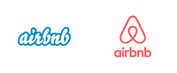
| Example | Google’s logo updates, Coca-Cola’s periodic logo tweaks, Starbucks logo simplification, Walmart 2025 logo update. | Dunkin’ (drop “Donuts” and new branding), Mailchimp’s 2018 overhaul (new logo & identity), Old Spice’s 2010s repositioning, Airbnb’s 2014 logo and message change. |
This summary clarifies when each approach is appropriate. For instance, if your product line and audience are essentially the same but the brand just looks a bit old, a refresh is usually enough. But if your company’s mission or market has dramatically shifted – say you’re merging with another firm or reaching into a brand-new country – a rebrand may be needed.
When to Refresh vs. Rebrand
How can a brand manager decide? Strategic cues include company goals and brand health. HubSpot suggests asking: are you simply modernizing, or do you need to reinvent? For example, if the brand is expanding internationally, merging with another company, or its core values no longer resonate, that points toward a full rebrand. Conversely, if the brand is holding steady but just feels visually outdated, a refresh is the safer path.
Below is a quick guide to typical scenarios:
| Situation/Trigger | Refresh Recommended | Rebrand Recommended |
|---|---|---|
| Visual identity is outdated | ✔ (tweak logo, colors, fonts) | ✖ (no need to change core) |
| Core strategy and audience remain same | ✔ (modernize style) | ✖ |
| Negative customer associations | ✖ | ✔ (reposition brand) |
| Merger or acquisition | ✖ | ✔ (align new combined brand) |
| Expanding into new markets | ✖ (maybe if minor) | ✔ (adjust positioning, perhaps name) |
| Company name change or pivot in business | ✖ | ✔ (full identity overhaul) |
| Campaign underperformance (branding suspected) | ✔ (refresh messaging) | ✖ (start with refresh first) |
| Feeling “stuck” despite solid strategy | ✔ (clean up image) | ✖ |
This table is a rule-of-thumb: real cases may fall between categories. For example, Slack’s 2019 brand update kept the iconic “octothorpe” logo concept but greatly simplified its color palette and icon to improve consistency. It was a partial rebrand – the company’s mission stayed the same, but the visual identity was overhauled for clarity. In contrast, when Dunkin’ (formerly Dunkin’ Donuts) changed its name and branding in 2018, that was a clear rebrand to emphasize coffee and modernize the chain.
Real-World Examples
Brand Refresh Case Studies
-
Google (“G” Logo) – In 2015 Google did a subtle brand refresh of its multicolored logo, evolving it to a cleaner, more geometric “G” and updating the font across products. The core brand and name remained, but the look got sleeker and more digital-friendly. Focus Lab cites this as a refresh example: “Colors may get updated, the logo may get redrawn for better legibility, but overall the change will be subtle”.
-
Coca-Cola – Over its history, Coca-Cola has refreshed its visual identity several times while holding onto the classic script and red color. Each tweak (slight font changes, label redesigns) has kept the brand familiar yet current. These iterative updates help Coke appeal to new consumers without losing its iconic status.
-
Starbucks – Starbucks’ 2011 refresh removed the “Starbucks Coffee” text from the circular logo, leaving just the mermaid. This was done to ensure the logo works in more contexts (like on cups and mobile screens) while keeping the instantly recognizable symbol. It was an evolutionary step: the brand still has the same identity, just a more minimalist presentation.
-
McDonald’s – In the mid-2010s McDonald’s refreshed its store interiors and packaging with more contemporary design. The Golden Arches and red-yellow theme stayed, but furniture, signage, and graphics were updated for a friendlier, modern feel. This was a refresh of the customer experience rather than a new brand story.
These refreshes share a theme: the companies wanted to stay “modern” without losing the goodwill they had built. As the crowdspring guide notes, refreshing is like updating your wardrobe – you keep your signature style but add some new pieces.
Rebrand Case Studies
-
Dunkin’ (Dunkin’ Donuts) – In 2018 Dunkin’ dropped “Donuts” from its name and revamped its logo with brighter colors and a friendlier font. This rebrand reflected a strategic shift toward beverages and convenience. The core philosophy (“great coffee, fast”) stayed, but Dunkin’ realigned its identity for the future. Notably, Dunkin’ kept its famous slogan “America Runs on Dunkin’,” ensuring some continuity for customers.
-
Mailchimp – In 2018 Mailchimp, originally known for email marketing, underwent a full rebrand as it expanded into a broader suite of marketing tools. The company introduced a new, more abstract logo and redesigned its branding to look more modern and less cutesy, aligning with its evolving business direction (adding automation, CRM, social media tools). The rebrand included a bold color palette and a sleek wordmark. According to Small Business Trends, this strategic transformation improved brand recognition and positioned Mailchimp as a “leader in digital marketing solutions”.
-
Old Spice – Once seen as an “old-man’s” aftershave, Old Spice executed one of the most famous rebrands in the 2010s. Under a new creative campaign and product redesign, it shifted to a humorous, meme-savvy tone and launched scents appealing to younger consumers. This overhaul (new messaging, ads, target demographic) revitalized the brand and dramatically boosted sales and awareness. As Crowdspring notes, Old Spice’s rebrand involved new scents and a completely revamped brand image.
-
Airbnb – In 2014 Airbnb rebranded with a new logo (“Bélo” symbolizing belonging) and a fresh brand story about creating community. The change accompanied a strategic shift as Airbnb grew beyond home-sharing into a wider travel platform. The visual identity and messaging were entirely redone to support this new positioning.
-
Burberry – In the 2000s Burberry rebranded to escape negative associations (gang-related misuse of its check pattern). The luxury label repositioned itself with new logos, marketing, and fashion lines. It realigned brand values around British heritage and high fashion, successfully transforming its image.
These rebrands had one thing in common: the companies used the opportunity to reset customer perceptions. They often went hand-in-hand with new strategy or product offerings. However, rebrands also carry risk: if fans don’t accept the changes, the backlash can be swift (think of the infamous one-week Gap logo debacle or Tropicana’s packaging fiasco). That’s why a full rebrand should never be done on a whim.
Strategy and Tips for Brand Managers
Whether you’re refreshing or rebranding, a smart, research-driven process is crucial. Here are strategic guidelines:
-
Audit and research first. Never start redesigning blindly. Conduct customer and market research to understand current perceptions and trends. Superside advises brand audits and competitive analysis: “Regular market research can reveal how your brand is perceived… [and] evaluating your visual identity, brand voice and overall brand experience can reveal which elements are outdated or underperforming”. If a brand’s visuals or messaging are lagging behind competitors, a refresh can solve that gap.
-
Align on strategy and goals. Clarify whether the core brand strategy still holds. If your company goals and values are fundamentally the same, you likely only need a refresh. But if you’re targeting new customers or markets, a deeper rebrand may be warranted. Remember, a rebrand requires commitment across the organization: leadership must embrace any shifts in mission, vision or market focus.
-
Involve your team and stakeholders. Even for a refresh, brand evolution shouldn’t be a silo project. Gather input from marketing, sales, design and even customers. HubSpot emphasizes brainstorming with a team so multiple perspectives guide which elements to update. For example, Slack engaged its user community when evolving its logo, resulting in a design that stayed true to its fans while maturing the look. A diverse team can help ensure you keep the most valuable parts of your brand intact.
-
Communicate with your audience. Use social media or surveys to soften the change. For a refresh, you can often roll it out gradually – perhaps reveal a new color scheme or slogan in advance and get feedback. Starbucks and Coca-Cola, for example, often test new packaging or logo tweaks in select markets first. If rebranding, make sure your messaging is clear: explain the reason for change and what it means for customers. Transparency can ease the transition.
-
Give it time, but not too much. Implement changes in stages if possible. For instance, HubSpot suggests “start with something small, like changing the font… and work from there,” measuring audience reaction at each step. This approach applies to both refreshes and rebrands – you might pilot new brand elements (a redesigned website landing page, updated logo on a product) before a full rollout. However, don’t drag out the process unnecessarily; a refreshed brand should launch firmly once ready, to keep the momentum going.
-
Maintain consistency. One pitfall is inconsistent branding. After any refresh or rebrand, update all touchpoints (website, social profiles, packaging, business cards, etc.) so customers get a coherent experience. Create clear brand guidelines documenting any new rules. If you leave old logo versions or messages floating around, it will dilute the impact of your effort.
Summary
Brand refreshes and rebrands are tools to keep your company relevant. A refresh tweaks the look and feel without altering your fundamental identity – think of it as polishing the brand you have. A rebrand, in contrast, recreates the brand to match new ambitions. By carefully assessing your company’s situation (through research and stakeholder input) and following a structured process, brand managers can choose the right path. As one expert puts it, “A refresh is an evolution of an existing brand and a rebrand is a reimagining”.
No matter your industry, the principles are the same: stay tuned to market shifts, involve your customers, and be strategic about change. When done thoughtfully, a brand refresh can rejuvenate an aging image, while a rebrand can open the door to new markets and opportunities. By keeping these best practices in mind, companies of any size can navigate the refresh-vs-rebrand decision and strengthen their brand for the future.
Also Read: 10 Signs It’s Time to Rebrand Your Business
To read more content like this, subscribe to our newsletter