Last Updated on May 7, 2021 by Team TBH
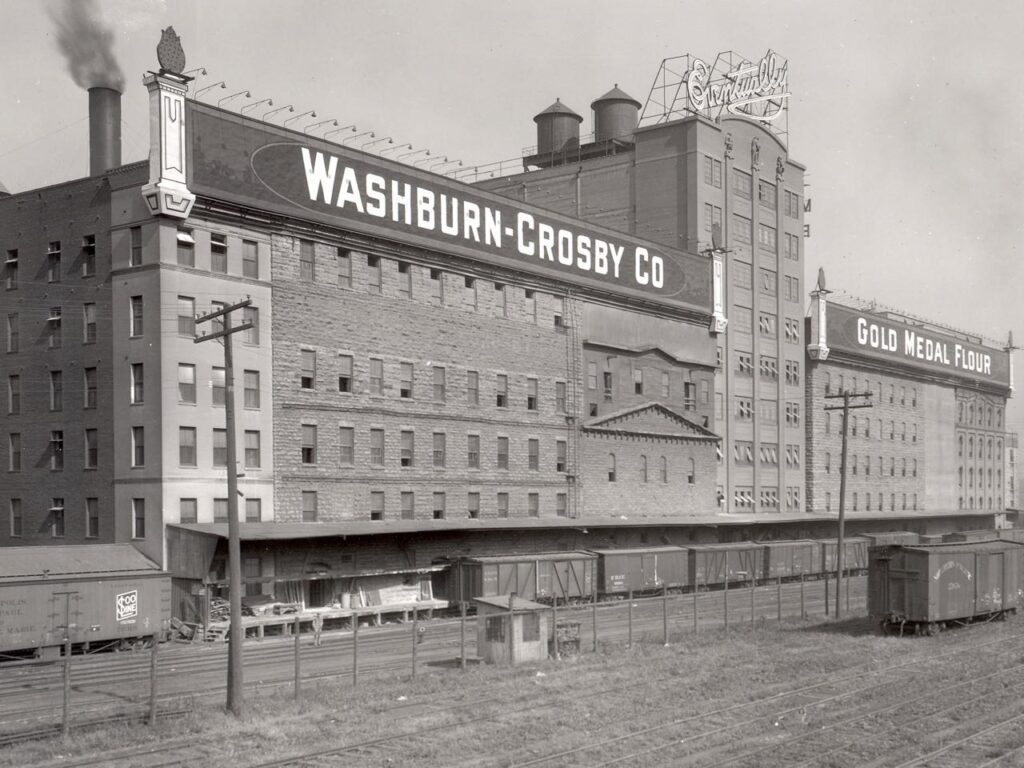
In 1921, Washburn Crosby Company, makers of Gold Medal flour, launched a picture puzzle contest. The contest
was a huge success—the company received 30,000 entries—and several hundred contestants sent along requests for recipes and advice about baking.
To handle those requests, the company decided to create a spokesperson. Managers chose the name Betty Crocker because “Betty” was a popular, friendly sounding name and “Crocker” was a reference to William G. Crocker, a well-liked, recently retired executive. The company merged with General Mills in 1928, and the newly merged company introduced the Betty Crocker Cooking School of the Air as a national radio program. During this time, Betty was given a voice and her signature began to appear on nearly every product the company produced.
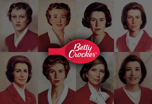
In 1936, the Betty Crocker portrait was drawn by artist Neysa McMein as a composite of some of the home economists at the company. Prim and proper, Betty was shown with pursed lips, a hard stare, and graying hair.
Her appearance has been updated a number of times over the years and has become more friendly, although she has never lost her reserved look.
Prior to a makeover in 1986, Betty Crocker was seen as honest and dependable, friendly and concerned about customers, and a specialist in baked goods, but also out-of-date, old and traditional, a manufacturer of “old standby products,” and not particularly contemporary or innovative.
The challenge was to give Betty a look that would attract younger consumers but not alienate older ones who remembered her as the stern homemaker of the past. There needed to be a certain fashionableness about her—not too dowdy and not too trendy, since the new look would need to last for 5 to 10 years. Her look also needed
to be relevant to working women.
Finally, for the first time, Betty Crocker’s look was also designed to appeal to men, given the results of a General Mills study that showed that 30 percent of U.S. men at the time sometimes cooked for themselves.
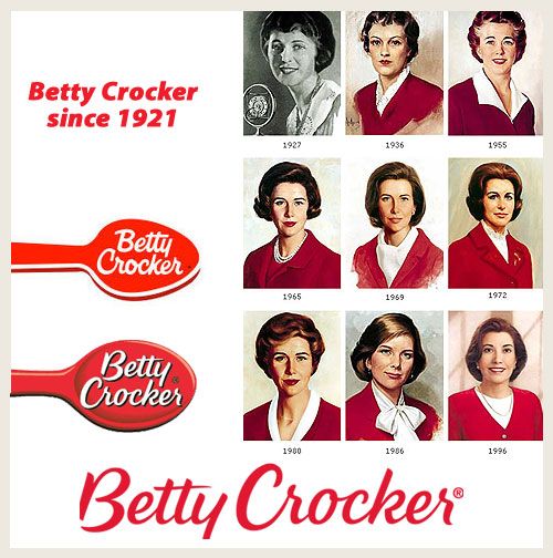
A few years later, Betty Crocker received another update. This ultramodern model, the current one, was the work of a committee that selected images of 75 women of many different races to create a computerized composite. This seventh makeover seemed to have taken—although Betty Crocker was now close to 75, she didn’t look a day over 35!
Although the Betty Crocker name is on 200 or so products, her visual image has been largely replaced by the red spoon symbol and signature on package fronts, and she appears only on cookbooks, advertising, and online, where she has over 1.5 million Facebook friends, a Twitter account, and a mobile app downloaded by millions.
If you like this case study, you should also read Aiming at the Echo Boomers