Last Updated on July 8, 2023 by Team TBH
Can you identify one of the most popular coffee-focused restaurants in the United States? If you guessed Dunkin Donuts, you would be correct, although there’s more to their brand than just serving delicious coffee. In an increasingly competitive market, Dunkin Donuts has become more daring in their approach to stand out. In this case study, we’ll learn about the famous rebrand of Dunkin Donuts and the impact of the rebrand on the company.
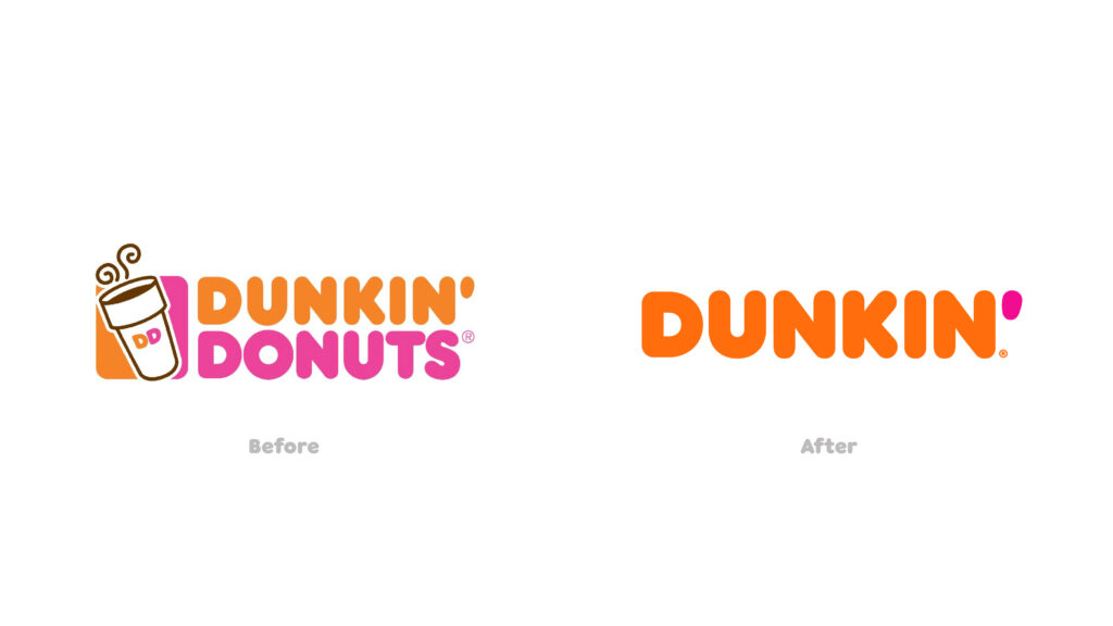
Were you aware that between 2018 and 2019, they underwent a rebranding process and changed their name from ‘Dunkin Donuts’ to simply ‘Dunkin’? Along with the name change, they made adjustments to their logo’s font type. This rebranding was significant, and today we will examine their strategy to understand what worked and how you can apply those lessons to your own brand.
What was the motivation behind Dunkin Donut’s rebrand?
Dunkin Donuts is the largest chain of coffee and baked goods in the world, with over 11,000 locations across 35+ countries. However, their size doesn’t make them immune to competition. With rivals like Starbucks, Einstein Bros., and others, Dunkin Donuts recognized that it was time to make a bold move in 2018 to reestablish their dominance in the market. And bold is precisely what they did.
They embarked on an extensive rebranding campaign that would transform the company’s image. Their primary objective was to position themselves as a ‘beverage-focused, convenient brand.‘ Through this rebranding effort, they aimed to:
Attract new customers: Like most rebranding campaigns, attracting new customers was a key goal. This would not only lead to increased revenue but also expand their customer base.
Increase sales: New customers naturally bring a boost in sales. However, they also aimed to increase sales from their existing customers. Changing a name may seem like a simple task, but for a company the size of Dunkin Donuts, it involved significant adjustments. They had to generate early awareness among consumers, partners, and product resellers.
The new branding conveyed the company’s focus on serving great coffee fast, while embracing Dunkin’s heritage by retaining its familiar pink and orange colors and iconic font, introduced in 1973.
Let’s explore the rebranding steps they took
Now that we understand their intentions behind the rebrand, let’s delve into the actions they took:
- They shortened their name from ‘Dunkin Donuts’ to ‘Dunkin.’
- They opted for a slightly more rounded font type.
- They invested $100 million in modernizing their stores. This was another bold move that aligned with their overall rebranding campaign.
Their goal was to enhance the visual appeal of their brand assets, going beyond print and digital materials. They went a step further by upgrading many of their interior and exterior store designs.
It’s important to note that they retained their existing color palette, which had already proven successful.
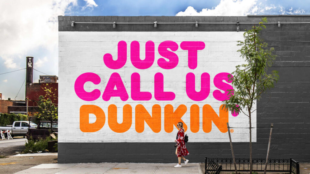
The shortened name appeared on all their packaging, advertising, website, and social media platforms.
These changes may seem minor, but they signify a shift towards simplicity. Furthermore, ‘Dunkin’ is a more daring and impactful name that complements their already vibrant and colorful branding (pink and orange).
With such a significant change, Dunkin Donuts actively promoted the transition through media channels. It took months of social media campaigns, updates in email newsletters, press releases, and consistent messaging to raise awareness among the public and internal teams about the upcoming changes.
What were the outcomes of Dunkin Donuts’ rebrand?
A bold change like this naturally attracts attention and generates a lot of press coverage, precisely what Dunkin Donuts aimed for. The change feels like an upgrade, signaling that Dunkin Donuts is moving forward in a rapidly evolving marketplace. Customers tend to gravitate towards companies that keep up with the times and uphold modern standards.
What lessons can you learn from Dunkin’s rebranding and apply to your own brand?
If we had to summarize Dunkin’s rebranding in one word, it would be ‘bold.’ However, boldness doesn’t work for every business or every rebranding effort. Dunkin Donuts’ color scheme and messaging were already bold, so the name change was bold but not a radical departure. It wasn’t extreme. When strategizing a rebrand, it’s crucial to ensure that the proposed changes align with your brand, cater to your customers, and meet their expectations.
Another lesson we can learn from this rebranding is that change doesn’t always necessitate a complete overhaul of fundamental aspects. Dunkin Donuts retained their bright, playful color scheme (orange and pink) because they recognize that it works for them.
Also Read: Case Study | Tropicana Rebranding Failure
To read more content like this, subscribe to our newsletter