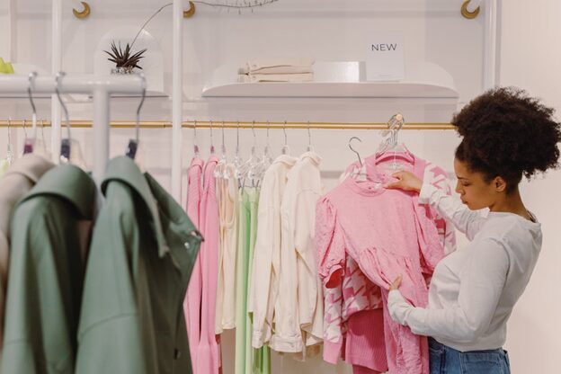
Shoppers read a store before they read a sign. Lighting, walking space, counter height, and where the eyes land first set the tone within seconds.
When those cues match from site to site, people feel they know the brand already. In Australia, teams like Revolution Retail focus on repeatable details that guide a person from the door to the right product and a smooth checkout. That is how brand storytelling moves from pitch slides to the floor.
Why Store Design Matters
Brand stories often live in taglines and ads, but people take them in through space and movement. The path from entrance to focal table, the frame around the service desk, the size and color of shelf labels, and the welcome at the counter all carry meaning. Keep those signals steady and you build memory.
This is not about decoration. It is about choices that support use. A pharmacy with clear sightlines to advice desks says fast and helpful. A café with warm task lighting over the pickup shelf says accurate and calm.
If those patterns repeat in Brisbane, Sydney, Melbourne, and Perth, customers do not have to learn the space again.
A steady look and feel also supports brand recall across touchpoints. Research on brand identity shows that repeated visual cues can raise recognition and trust across channels, not only in ads.
What Consistency Looks Like
- Consistency needs rules that are simple to follow on busy projects. Aim for a short kit that repeats, and room to adapt to site limits.
- Set a fixed type scale, color use, and placement logic. Header signs sit at one height. Category cards follow a single template. Shelf labels use one font size and a clear contrast for easy reading.
- Define light targets for entry, main floor, and feature bays. Keep color temperature steady. Build a small list of approved fittings so replacements match across stores.
- Materials and finishes. Choose a short list that wears well. One main floor finish, one wall paint range, one counter surface. Keep maintenance simple so local teams can source and care for parts without special orders.
Set Simple Rules
Decide how people queue, pay, and collect. If fast pickup matters, design a pickup shelf with clear lines from door to counter. If personal advice matters, add a small private nook. Training and scripts can match the layout.
For the back of house, repeat storage layout, bin sizes, and bench heights. Staff can move between sites without re-learning the space.
From Plan to Site
Good drawings help, but the field stage is where a plan holds or slips. Start with a brief that links brand values to measurable features. Do not write “premium feel.” Write “entry portal at 2400 mm with warm lighting and a brass pull.”
Create a fitout guide from the first reference store. Use photos with callouts. Add a schedule of finishes, hardware, and fixtures with supplier codes. Mark “no swap” items where a change would break the look. Mark “site swap” items where a local match is fine.
During tender, share the guide and hold a walkthrough to explain why each rule exists. On site, use checklists by area so crews can self-check before inspections. Ask for progress photos from fixed camera points. These habits save days at the end.
Quality checks should focus on the few details that carry the story. The entry portal, cash wrap, feature wall, and hero bay deserve extra care. A shelf strip set a few millimeters off can ruin the line across a long run.
Measure What Shoppers Notice
You cannot manage what you do not track. Pick a short list of signals that connect fitouts to shopper response. Dwell time near hero bays shows if focal points work. Conversion at the counter shows if the path and service steps are clear.
Basket size and add-on rate show if cross-merchandising bays sit in the right place.
Camera heat maps or simple staff tallies can reveal dead zones and strong lines of sight. Wayfinding studies can test if people can find service areas fast. You do not need a lab. Keep a brief dashboard and update it after each refit or new opening.
When patterns appear, change the rules. If people miss pickup shelves, raise contrast on the header sign or adjust light levels in that zone. If queues block the entrance at peak, change the corral width and move payment terminals. Treat the guide as a living document.
Wayfinding has a long history as a design practice that helps people move and choose. A plain summary is here: https://en.wikipedia.org/wiki/Wayfinding.
Keep Costs Under Control
A steady kit saves money over time. Standard parts allow bulk buys and faster replacement. Clear rules speed up shop drawings and site work. There is a trap, though, in forcing one layout on every site. A small kiosk and a large corner store do not need the same number of bays or the same counter length.
Solve this with tiers. Core kit repeats everywhere, like the entry portal and the cash wrap. Optional kit adds or drops based on size and trade zone. Site-only items solve true constraints, like columns or heritage walls. This keeps the look steady and avoids waste.
Plan the rollout calendar with operations and marketing. Openings that align with campaign peaks let you test layout choices under real load. Gather staff feedback in week one. A small shift in queue posts or POS cable paths can pay back at once.
Fix Common Friction
- Older buildings. Survey early and confirm floor levels and load limits. Use modular counters with adjustable plinths so heights stay within the guide even when floors vary.
- Supply gaps. Pre-approve alternates for low risk items that still match the look. For high impact items like the entry portal, pre-book long lead parts or hold a small buffer.
- Set counter heights, aisle clearances, and turning circles in the guide from the start, not as site exceptions. Good access helps more people shop and cuts rework.
- Write short care notes for each finish. If staff know which cleaner to use on a counter, that counter still looks right after two years.
One Playbook for Teams
Marketers need proof that the story reaches the customer. Fitout teams need proof that the rules work on site. A steady store network delivers both. It turns values into things people can see and use.
It gives operations a clear plan for training and upkeep, and makes each new site feel familiar, which lowers mental load for customers and staff.
People tend to like what they recognise. Repeated contact can raise comfort and trust, which helps sales. Clear routes also cut stress and speed visits, which matters in busy city sites. When teams share a guide and use it, the logo is not doing the work alone.
The space speaks for it, from threshold to till.

Final Takeaway
Brand storytelling sticks when stores tell the same story every time. Build a short ruleset, protect the few details that carry meaning, and track how people move and buy. Use that feedback to keep the guide sharp. Do that, and your message holds from one site to the next.
To read more content like this, explore The Brand Hopper
Subscribe to our newsletter