Last Updated on June 25, 2025 by Team TBH
Pantone’s story begins in a small New Jersey print shop but has grown into a global color empire. In the early 1960s, Hofstra graduate Lawrence Herbert transformed a struggling printing‑ink business into the “universal language” of color. In 1962 he bought the company and, by 1963, invented the Pantone Matching System (PMS) – a standardized system of color chips and codes that allowed any designer to specify an exact shade and any printer to reproduce it faithfully.
As Pantone’s Vice President Laurie Pressman explains, the company “began in 1963 as a color language standard of 10 colors intended to enable accurate reproduction of color for the print industry,” and through focus and innovation it “became an authority” that now serves “millions of clients around the world” in every design field.

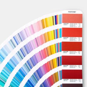
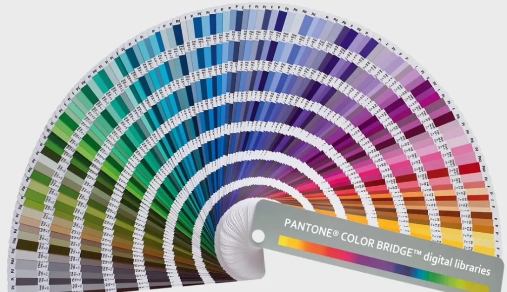
Pantone’s color guides – the iconic swatch books – turned into indispensable design tools. By assigning numbers (and later evocative names) to each pigment, Pantone solved a fundamental problem: inconsistent color reproduction. The PMS fan decks ensure that graphic designers, publishers, printers, and manufacturers across the globe can all “color match” exactly.
Over decades Pantone has expanded far beyond its original 10 colors: today it catalogs tens of thousands of unique color IDs, covering print, plastics, textiles, home paints, digital media and more. This rapid expansion was no accident. Lawrence Herbert aggressively marketed the PMS to beat out competing systems, so that Pantone quickly became “the graphics industry standard”. Indeed, Pantone’s color libraries – whether on paper or in software – are now the de facto worldwide standard for specifying color.
Pantone’s “Color of the Year” campaigns (here illustrating Ultra Violet, the 2018 choice) underscore the brand’s vibrant influence. Each year Pantone selects a hue that it declares emblematic of global zeitgeist, ensuring the company’s name and palette dominate design conversations worldwide. (Image: Designboom)
Origins and Founding Vision of Pantone
Pantone’s roots lie in a New Jersey printing firm called M & J Levine Advertising. In 1956 the Levine brothers hired Lawrence Herbert, a chemist, to improve their ink inventory. By 1962 Herbert had revolutionized their color systems, and he struck a deal to buy out the printing division for $50,000.

Renaming the business Pantone, Herbert set out to create “a universal language for color” – one that would allow a designer’s choice of Carnation Pink or Royal Purple to mean the same thing to anyone, anywhere. His founding vision was simple yet powerful: standardize color so creativity could flourish. Pantone’s first product was a set of ten precisely formulated color swatches; this modest beginning would ignite a century-long transformation of how industries use color.
From the start, Pantone focused on designers’ needs. By systematically organizing pigments and inks, the new PMS let printers reproduce any color with confidence. Designers adopted Pantone chips like a new alphabet, and soon it was easier to call a color by its Pantone code than to explain it in words. Pressman notes that Pantone built its authority “through our focus and dedication on the business of color; developing tools and services that help the designer realize his creative vision”. In other words, Pantone became indispensable by solving a basic workflow challenge.
Building a Global Standard: The Pantone Matching System
Pantone’s Matching System (PMS) is still at the heart of its influence. By assigning each shade a unique number (and often a memorable name), Pantone created a color dictionary that transcends factories and borders. Graphic designers, printers and manufacturers the world over use these chips to guarantee that a given hue – say, a corporate red – looks identical on screens, paper, fabric or plastic. As Wikipedia describes, “the idea behind the PMS is to allow designers to ‘color match’ specific colors when a design enters production … This system has been widely adopted by graphic designers and reproduction and printing houses”.
Pantone’s famed swatch “fan decks” let designers pick the exact hue they need. Each fan deck contains hundreds of little color chips (like those seen here). These guides made Pantone’s system easy to use and have become iconic design objects in their own right.
The Pantone guides are meticulously crafted: Pantone technicians mix pigments by hand to create each color, and they even train to distinguish minute differences in shade. (All Pantone color techs must annually pass a Farnsworth–Munsell hue test to show they can see fine gradations.)
The Pantone company continuously updates its library – adding metallics, pastels, neons, and patterns – and releases new editions as printing inks age or digital screens change. In short, Pantone “serves millions of clients around the world as a source of inspiration for the global design community”. Today a Pantone swatch guide is as common in a designer’s toolbox as a ruler or pencil; the Pantone “chip” symbol (a colored rectangle with its code) has become instantly recognizable across many creative fields.
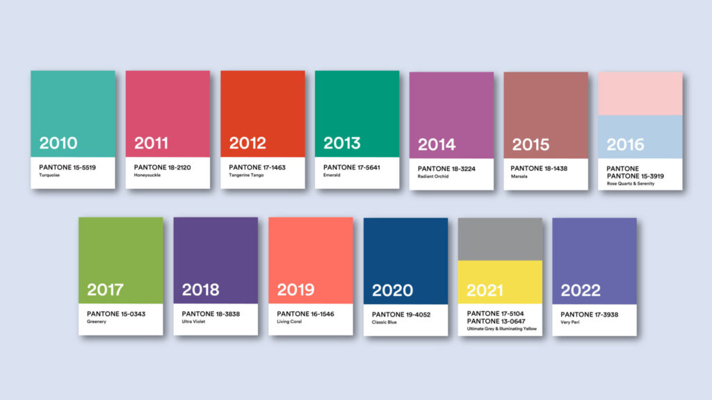
Pantone’s role as a global color reference was cemented by strategic naming and marketing. In the 1980s and ’90s Pantone began giving its colors evocative names (e.g. Tangerine Tango, Classic Blue, Rose Quartz) in addition to numbers. This seemed a small touch, but it made colors more memorable and fun.
Ridge Marketing notes that “naming gave colors a personality” and helped industries from fashion to tech (e.g. Silicon Valley companies) embrace Pantone hues. In 1986 Pantone even formed the Pantone Color Institute™ – a consulting and trend-forecasting division – which advised brands on color strategy and launched the company into trend leadership. Through such moves, Pantone transitioned from solely a “color authority” to a “creative partner” that companies actively sought out for color insight.
Pantone Across Industries
Pantone’s influence now spans far beyond its printing origins. It is used in graphic design and printing (where it started), but also in fashion, textiles, product and industrial design, packaging, retail, digital media, and even manufacturing of paints, plastics and fabrics. In each of these fields, Pantone provides the color vocabulary that keeps brand colors and trends consistent.
For example, a clothing line may choose Pantone’s seasonal palette for its fabrics; an interior decor company may paint walls using Pantone-approved colors; a tech gadget manufacturer will specify its casings using Pantone RGBA values. As Pantone itself emphasizes, its system bridges coated and uncoated paper, cotton, polyester, nylon, plastics and more – every material where color matters.
Fashion designers consult the Pantone seasonal forecasts, and retailers like Home Depot or Benjamin Moore use Pantone data when developing their paint lines. Likewise, major graphics software and printing services bake Pantone libraries into their workflows, so a graphic designer’s “PMS 185” is consistent worldwide.
Pantone even coined the phrase “the universal language of color” for its software tools. In short, whether it’s a logo on a billboard, a dress on a runway, or packaging on a store shelf, Pantone colors ensure brand colors are reproduced faithfully and recognized universally.
This wide adoption is evident in Pantone’s collaborations. The brand’s color palettes frequently inspire entire product lines. Pressman notes that Pantone “develop[ed] tools and services” so designers could realize their vision and maintain consistency.
For consumers, this means we see Pantone’s hues everywhere: a cellphone might debut in a new Pantone shade; home décor collections often lean on Pantone-guided palettes; even paint companies announce lines in Pantone colors. In fact, Pantone formed a Fashion, Home + Interiors division precisely to cater to interior designers and home-product brands – another sign that Pantone’s reach extends far beyond paper and ink.
The Color of the Year: Impact and Cultural Significance
Perhaps Pantone’s most famous initiative is the annual Pantone Color of the Year. Introduced in 2000, this marketing campaign selects one (or sometimes two) color(s) that Pantone deems representative of the global mood. “Pantone LLC was founded in 1962 but didn’t become a household name until debuting its famous superlative in 2000, ‘Pantone Color of the Year,’” notes a printing industry blog. Since then, each December’s announcement – accompanied by a styled photo shoot, trend report, and press blitz – has become a much-anticipated cultural moment.
Every major industry watcher pays attention. Pantone itself observes that the Color of the Year “has immensely influenced visual culture across industries”, with fashion buyers, interior designers and product manufacturers all “taking note” of the forecast.
The chosen hue swiftly appears everywhere: in home furnishings, makeup collections, advertising campaigns and even social media memes. Pantone’s predictive power is underscored by partnerships: retailers like Lowe’s build home-decor lines around the Pantone hue, beauty chains like Sephora and MAC release matching cosmetics, and even FedEx prints the color on shipments and stationery. Adobe and other digital platforms tag stock images with each year’s color. Every December the announcement goes viral, proving that a color can be its own trending topic.
Laurie Pressman explains Pantone’s process: the chosen color “best communicates what is taking place in our global culture at a moment in time” – one that “serves as an expression of a mood and an attitude on the part of the consumers”.
Pantone’s announcements often tap into social themes: for example, the healing Peach Fuzz (2024) was described as “caring and sharing,” while Viva Magenta (2023) was billed as galvanizing and bold. In short, the Color of the Year has become a storytelling device and marketing engine in itself. Its effectiveness is acknowledged even by analysts: Ridge Marketing notes that the Color of the Year is “a highly effective marketing tool the company uses each year to promote its brand”.
Beyond publicity, the Color of the Year can drive sales and design directions. As one marketer observes, companies leverage Pantone’s psychology: investors in color forecast that “the right color can sell products and ideas more effectively by 50–85%,” and Pantone provides the data and consultancies to make those decisions.
In this way, Pantone’s color forecasts become a feedback loop – shaping trends and reflecting them back to consumers. Whether or not one agrees with their power, there’s no doubt that Pantone’s yearly campaign cements the brand’s role as a design tastemaker.
Voices of Pantone: Insights from the Color Institute
Pantone’s story comes to life through the words of its experts. In interviews Laurie Pressman often emphasizes color’s emotional power: “I am a color lover,” she says. “For me color is life; it is expression; it is freedom. Color engages. Color defines”. In her view, color literally sets the mood of life – “without color, life could be a vision of black and white,” and such a world “would not be enough to capture the essence and bounty of all that life has to offer”.
Pressman also highlights Pantone’s mission as an ongoing mission: “We work every day to inspire designers and make color-critical decisions easier”. She explains that Pantone’s teams comb the world for new trends – from art and fashion to technology and media – then codify those influences into actionable palettes. On what makes Pantone unique, she points out that “color touches everything”. Pantone works in color psychology for many famous clients: Pressman recounts helping choose “the right purple to represent Prince, working with Conan O’Brien’s team to come up with the right orange, or working with LG to develop the right colors for their products”. She adds that Pantone’s unexpected collaborations have ranged “from NASA, [to] the Underwater Agency or Universal” – proof that anyone with a visual story might turn to Pantone to articulate it.
Inside Pantone’s branding team, the same passion is echoed. In a recent interview the company stated: “Pantone is an iconic name in design. Epitomized in the Pantone chip, our brand aesthetic is simple, fun, bold and elegant.” They stress that their core value is celebrating the importance of color in design, and that they seek to “inspire designers and make color-critical decisions easier at every stage of the workflow”. (Pantone even likens its licensing products – from notebooks to mugs – to democratizing design for the masses.) These insider quotes reinforce a key point: Pantone’s identity is built squarely on color itself. Its leadership speaks almost poetically about color because the brand is, at its heart, a celebration of color.
Notable Partnerships and Brand Collaborations of Pantone
Pantone’s cachet has led to some eye-catching collaborations. The company regularly teams with major brands to co-create products that spotlight color. For example, fashion retailer Supreme launched a special-edition Pantone Formula Guide this fall, a fan-deck featuring all 2,390 Pantone colors co-branded with Supreme’s name.
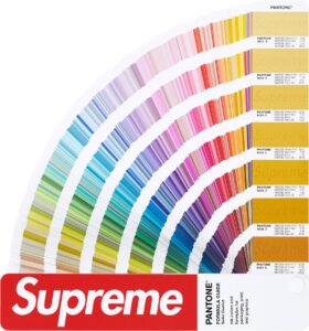
This collaboration “brings together Pantone’s color expertise with Supreme’s iconic branding”, offering a collectors’ item that bridges professional design and streetwear. Similarly, fast-fashion giant Zara partnered with Pantone to design a capsule collection. Zara’s capsule introduced four “organic” neutral shades, effectively using Pantone as a curator of style – in Pantone’s words, allowing the company to “promote its expertise in colour curation within the context of” a global brand.
In the consumer goods arena, Pantone has also partnered with unexpected names. In 2024 liqueur brand Jägermeister ran a striking campaign: for the first time, they released matte monochrome bottles in Pantone-approved Herbal Green and Culture Orange – their signature colors.
This co-branding (with Pantone even named on the packaging) was designed “to redefine and standardize its core brand colors,” and it exemplified how Pantone’s color authority can enhance a brand’s visual identity. Sports and lifestyle brands have similar tales: for the 2022 and 2023 color announcements, sneaker company Cariuma became Pantone’s official footwear partner, releasing limited-edition shoes in the Color of the Year.
Retailers and media are in on it too. Pantone’s Color of the Year is often tied to product lines: Lowe’s home centers each year introduce lines of furniture and décor in the Pantone hue, and cosmetics companies like Sephora and JCPenney launch make-up collections to “wear” the Color of the Year.
Even airlines and tech firms get involved: FedEx printed Pantone’s color on envelopes and uniforms, and Adobe created color-themed design templates. As one overview notes, Pantone’s corporate partners range from Lowe’s, Sephora and JCPenney to Firmenich (fragrances) and Audio UX (a startup turning colors into sounds) – all demonstrating how deeply Pantone’s annual color permeates products and media.
These collaborations are mutually beneficial. Pantone gains cachet by appearing alongside aspirational brands, while the partners borrow Pantone’s credibility. An industry marketing article sums it up: teaming with Pantone “can elevate brand perception and reach new demographics”. Put simply, any brand that works with Pantone taps into the mythos of the world’s color authority, signaling seriousness about design and giving consumers a memorable talking point (e.g. “my lipstick is the Pantone Color of the Year!”).
Beyond Design: Psychology, Marketing, and Pop Culture
Pantone’s influence leaks well outside design studios. In marketing and psychology, Pantone is often cited in studies of color effect. The company itself highlights the science: Pressman notes that up to 95% of consumer purchasing decisions are subconsciously driven by color.
By tapping into that psychology, Pantone’s trends (like Color of the Year) become heuristic guides for many brands: if Pantone says a color is “calming” or “vibrant,” advertisers use that narrative to craft their messages. The Pantone Color Institute even conducts word-association studies to back its forecasts, reinforcing how the brand blends art with data.
Culturally, Pantone has become a shorthand in media and everyday life. Design blogs and lifestyle magazines regularly cover Pantone announcements, and sometimes Pantone references pop culture events. (For example, Pantone collaborated with Leo Burnett on a special “Queen’s Jubilee” color guide, even documenting Queen Elizabeth’s color choices.)
Pantone colors show up in movies, art installations and fashion shows – “the language of color” that Pressman mentions is so pervasive that everyone from NASA (as Laurie notes) to environmental NGOs calls Pantone when naming new phenomena. Even real estate joins in: Airbnb once created a bookable “Pantone Greenery” apartment, proof that Pantone’s role has gone beyond paint swatches to become a cultural experience.
In marketing, Pantone deftly leverages its story as content. By framing color choices as significant, Pantone has essentially branded itself as a lifestyle trendsetter. Every December, newspapers report the Color of the Year like it’s a high-fashion event. Consumers meanwhile have started decorating homes and wardrobes around Pantone palettes (witness the “millennial pink” craze after a recent Pink Year). In pop culture, even outside of design circles, people say things like “that shirt is Pantone 300” or gift Pantone-themed merchandise to designers. In effect, Pantone has turned what began as a technical printing tool into a set of cultural symbols – colors laden with meaning, backed by a brand with a clear identity.
What Makes Pantone’s Branding Iconic and Effective?
Pantone’s unique approach to branding – where color itself is the product and the logo – has created an instantly recognizable identity. Several factors contribute to Pantone’s iconic status:
-
A Universal Visual Cue: The Pantone chip and fan-deck design are unmistakable. The simple act of pulling out a Pantone swatch card in a meeting immediately signals that color precision is happening. As Pantone puts it, the brand is “epitomized in the Pantone chip”, a design both fun and elegant. This consistency (the logo always over a solid color) means Pantone’s look is bold yet consistent across every use.
-
Memorable Naming and Narrative: Pantone gives colors more than a number; it often gives them a name or story. Names like “Living Coral,” “Classic Blue” or “Ultra Violet” humanize the palette and invite media coverage. By tying each hue to emotions or trends – *“Rose Quartz” for warmth, *“Marsala” for sophistication – Pantone turns colors into characters in a broader cultural drama. This storytelling gives companies tangible narratives (e.g. “wearing the Color of the Year means you’re on trend”). Pantone’s own marketeers note that naming colors gave them personality that appealed even to industries like Silicon Valley.
-
Annual Event for Brand Attention: The Color of the Year campaign is practically a brand holiday. It generates press and social buzz every year, keeping Pantone top-of-mind for professionals and consumers alike. By expertly timing announcements and partnering with media (from trend blogs to national press releases), Pantone uses the Color of the Year as a PR engine. In effect, Pantone markets itself by marketing color – the brand narrative is the calendar.
-
Cross-Category Licensing: Pantone has smartly extended its brand into lifestyle products. Its licensing arm produces notebooks, mugs, phone cases and even hotel decor, all featuring Pantone’s aesthetic and color philosophy. This consumer presence reinforces the brand’s core message (“Color is powerful, and Pantone makes it accessible”). By democratizing design in this way, Pantone’s palette becomes part of everyday life, and the brand personality (simple, fun, bold, elegant) shines through in these goods.
-
Authority and Expertise: Finally, Pantone’s approach rests on expertise. The Color Institute’s research and forecasting position Pantone as authoritative tastemaker. Marketers trust Pantone’s data on color psychology, and designers trust its precision. Pantone doesn’t just sell products; it sells confidence in color decisions. This credibility is a rare branding asset: Pantone truly owns the idea of “industry color standard,” and it enforces it by carefully managing its image (consistent swatch design, authoritative language, and selective partnerships).
Together, these strategies make Pantone’s brand both iconic and effective. The company isn’t pushing a fad; it’s built a coherent narrative where every shade – and the brand itself – is meaningful. By turning an abstract concept (hue) into a solid, licensed commodity, Pantone has crafted one of the most distinctive and respected identities in the design world.
Also Read: Exploring Motorola’s Detailed Marketing Strategies
To read more content like this, subscribe to our newsletter