Last Updated on July 27, 2026 by Team TBH
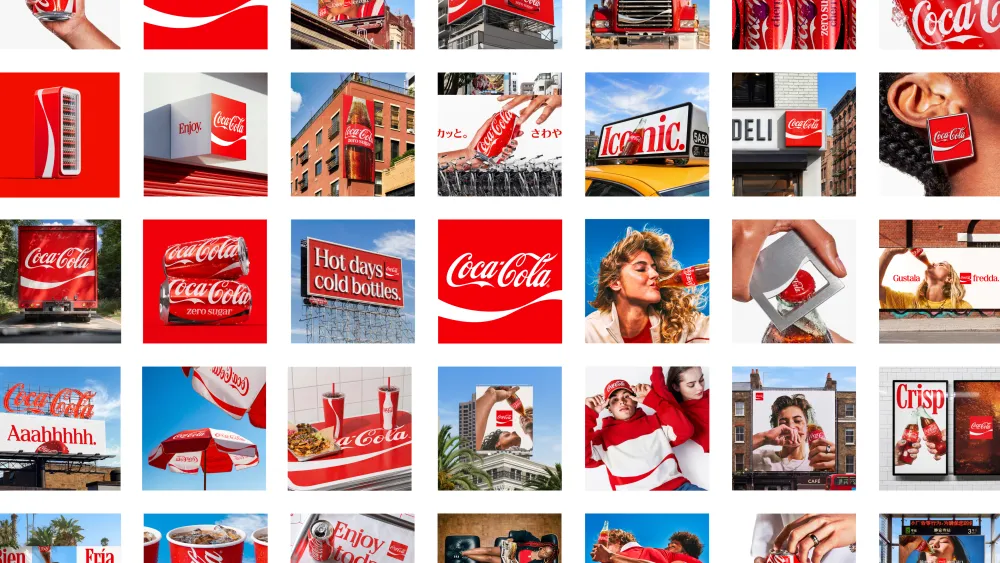
On July 20, 2026, The Coca-Cola Company launched a new global visual identity system — its biggest brand-consistency push since 2021 — rolling out across more than 200 markets. Developed with branding agency JKR, the refresh doesn’t reinvent the brand. Instead, it doubles down on the assets the world already associates with Coca-Cola: the red-and-white palette, the Spencerian script, the Dynamic Ribbon, and the Arden Square, giving each greater prominence everywhere the brand shows up, from cans and coolers to retail signage and digital screens.
The strategic brief behind the project, according to the company, was simple: make every Coca-Cola execution look and feel unmistakably Coca-Cola.
Why Coca-Cola Refreshed Its Identity
Coca-Cola is sold in more than 200 countries through a vast network of bottlers, retailers, and marketing agencies, each historically applying the brand’s visual assets with some degree of local variation. Over time, that flexibility diluted consistency: the same red-and-white system looked and felt slightly different from one country, retailer, or vending machine to the next.
“Coca-Cola is one of the most recognized brands in the world, and with that comes a responsibility to keep evolving,” said Arnab Roy, President, Coca-Cola Global Category, in the company’s official announcement. “This refresh is about being clearer and more consistent in how we show up, wherever people experience our brand. By building on the things people already know and love, we’re creating a stronger foundation for growth while staying unmistakably Coca-Cola.”
Rapha Abreu, Global Vice President of Design at The Coca-Cola Company, framed it as an act of focus rather than reinvention: “For over a century, Coca-Cola has been a global symbol of optimism and authenticity. Now, with one seamless visual identity, we can deliver one recognizable brand experience to consumers.”
What Actually Changed
Unlike a traditional rebrand, nothing about Coca-Cola’s core visual vocabulary is new. What changes is how boldly and consistently those elements are used.
The Dynamic Ribbon, amplified. First introduced in 1969 to unify the brand across an expanding range of packaging formats, the Dynamic Ribbon becomes the anchor of the new system. It’s used more prominently across cans, bottles, coolers, vending equipment, and retail environments.
The Spencerian script, sharpened. Coca-Cola’s iconic cursive wordmark, one of the most recognized pieces of typography in the world, gets more visual weight and consistency across formats.
The Arden Square and red-and-white palette, reinforced. Both core brand assets are given greater prominence to strengthen shelf standout and recognition at a glance.
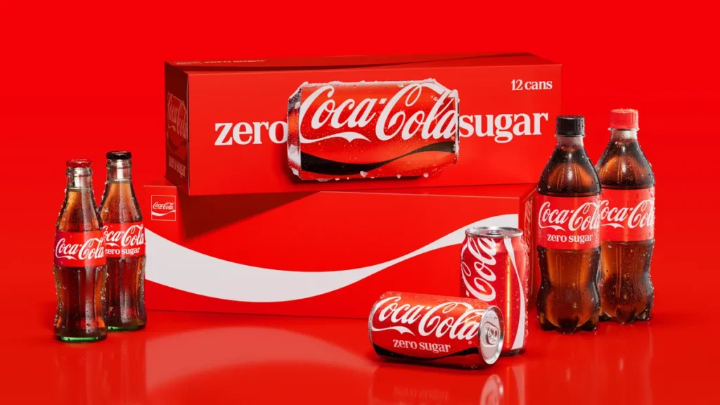
Cans go vertical again. The most visible packaging shift is the wordmark returning to a vertical orientation on cans, reversing the horizontal treatment that had been in place for roughly the last decade.
Multipacks get a new focal point. Multipack boxes trade the elongated, horizontal wordmark that previously ran across the face of the pack for imagery of a can positioned horizontally, shifting the visual anchor from typography to product.
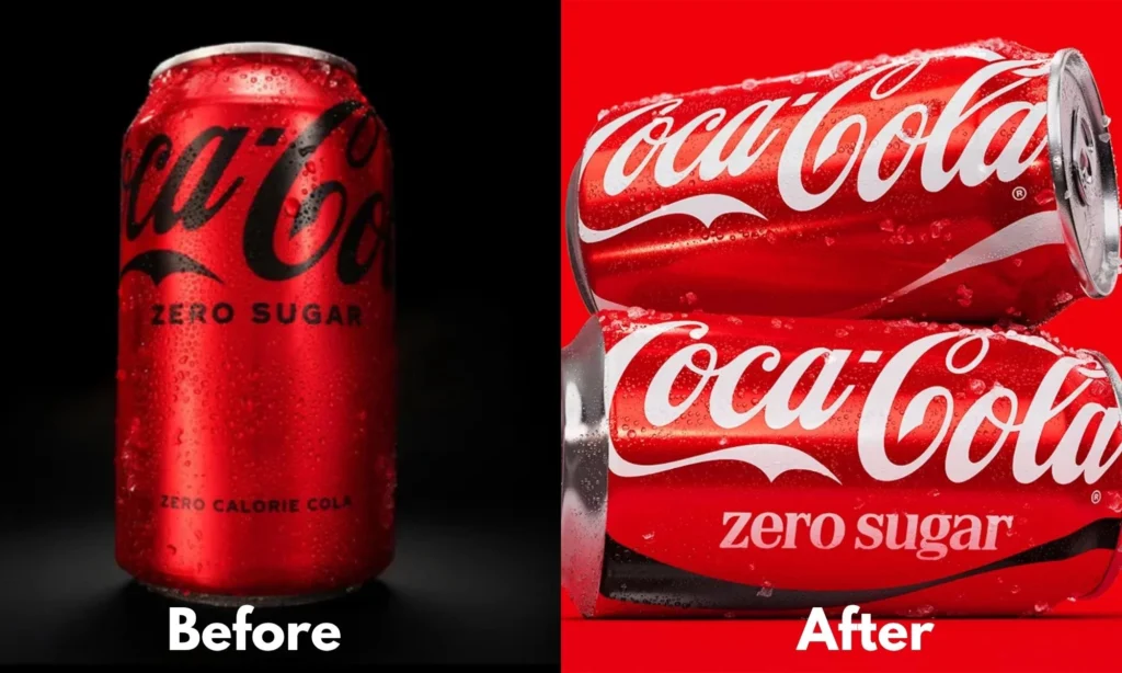
Coca-Cola Zero Sugar Gets Its Own Distinct Identity
Rather than simply mirroring Coca-Cola Classic with a color swap, Coca-Cola Zero Sugar receives its own point of difference within the new system:
- A prominent black Dynamic Ribbon on cans, replacing the previous treatment
- A black bottle cap on PET packaging, instead of the standard red
- Larger “Zero Sugar” typography, now set in a serif typeface for greater presence
- The Zero Sugar wordmark shifts from black to white, improving contrast against the black ribbon
The goal is a clearer hierarchy that makes Zero Sugar instantly distinguishable from Coca-Cola Classic on shelf, without breaking from the same family of visual cues.
The Agencies Behind the Refresh
The project was led by JKR (Jones Knowles Ritchie), which owned the overall global brand identity work. Packaging design was handled by The SUPERULTRARARE, which reimagined the packaging system, while Brody Associates led typography.
Notably, this is JKR’s second major heritage-driven refresh for a major beverage brand in under a year — the agency also led Schweppes’ recent identity update, which revived its classic “Skittle” bottle shape and brought back mascot Clive the Leopard. Industry observers have pointed to this as a sign that “amplify, don’t replace” is becoming a broader strategy for legacy brands looking to modernize without risking the kind of backlash that hit brands like M&M’s after its 2022 character redesign.
A New Brand Center and AI-Powered Design Governance
To manage a rollout of this scale, Coca-Cola introduced two new internal tools alongside the identity itself:
Brand Center — an immersive hub giving Coca-Cola’s internal design and marketing teams, plus its global network of agency partners, a single source for approved assets, colors, and typography.
Design Intelligence — an AI-powered tool, developed with Adobe and trained on Coca-Cola’s brand archives, that checks new creative work against brand standards before it ships. In practice, this means a local bottler or agency in any of Coca-Cola’s 200+ markets can get an on-brand compliance check in seconds rather than waiting days for manual sign-off — a governance bottleneck that has historically caused many global brands to drift off-identity between markets.
Design commentators have noted this as a meaningful shift in how Coca-Cola is using AI: rather than deploying it for consumer-facing creative (an approach that drew criticism for the brand’s AI-generated holiday ads in both 2023 and 2024), the technology is being used behind the scenes as a quality-control layer, freeing human designers to focus on creative decisions.
Rollout Timeline
The new identity is rolling out first across Latin America, Europe, the Middle East, and Asia, touching packaging, retail environments, equipment, and digital experiences. Notably, North America will not receive the new look until 2027, meaning US and Canadian consumers won’t see the refreshed cans and packaging on shelves for some time.
The Business Context
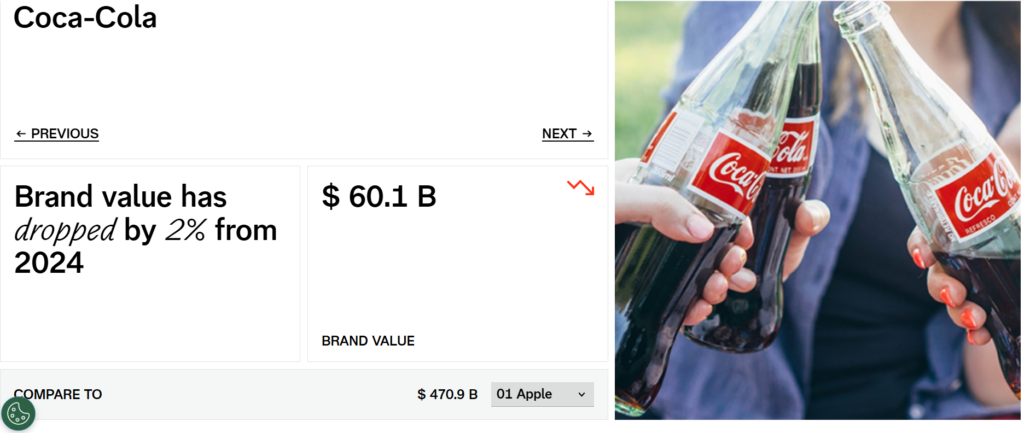
The timing underscores just how much is riding on brand consistency at scale. Coca-Cola ranks No. 7 on Interbrand’s Best Global Brands list, with a brand value of $60.1 billion. It’s the world’s largest total beverage company, selling roughly 500 brands in more than 200 countries and serving an estimated 2.2 billion beverages every day.
At that scale, even small inconsistencies in how the logo, ribbon, or color palette are rendered compound across billions of daily brand impressions. Strengthening recognizable assets — rather than introducing new ones — is a lower-risk way to protect that value while still signaling evolution.
Key Takeaways for Marketers and Brand Teams
Familiarity beats reinvention. Coca-Cola’s approach reinforces a broader industry trend: for brands with deep equity, amplifying existing recognizable assets tends to outperform a full visual overhaul, both in consumer reception and risk management.
Governance is now part of brand design. Launching a global identity is only half the job; Coca-Cola built dedicated tools (Brand Center and Design Intelligence) specifically to keep thousands of teams applying it consistently after the initial launch buzz fades.
AI works best in the background. Using AI for brand-compliance checks rather than creative generation may offer a template for other large brands wary of AI-related backlash.
Sub-brands need their own signals. Coca-Cola Zero Sugar’s distinct black-and-white treatment shows how a master brand system can still carve out clear differentiation for product variants without breaking the overall family resemblance.
Bottom Line
Coca-Cola’s 2026 visual identity refresh isn’t a redesign in the traditional sense — there’s no new logo, no new color, no reinvented mascot. It’s a consistency play: taking assets the world already recognizes (the script, the ribbon, the red) and enforcing them more rigorously across 200+ markets, backed by new internal tooling to make that consistency stick. For one of the most valuable and widely distributed brands on the planet, the boldest move wasn’t changing how it looks — it was making sure it always looks like itself, everywhere.
Also Read: Case Study Analysis: Coca-Cola’s “Taste the Feeling” Campaign
To read more content like this, subscribe to our newsletter